
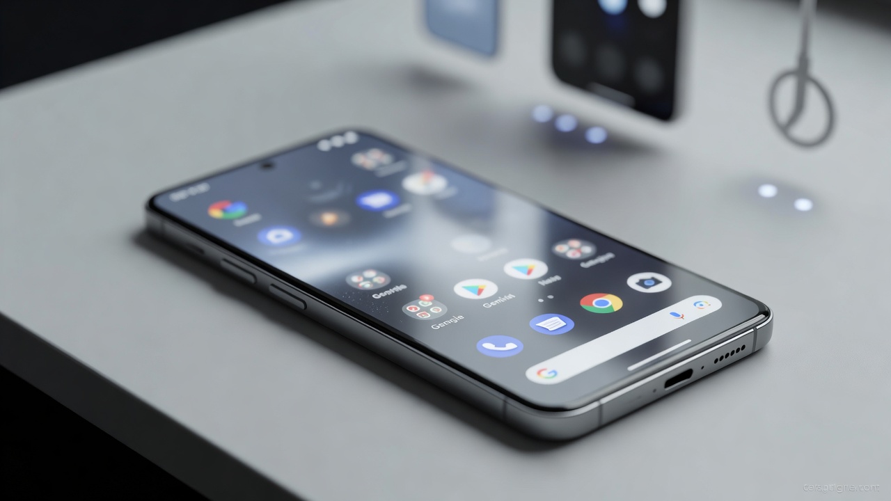
Google has begun pushing a visual overhaul to the Gemini AI overlay on Android devices. The change replaces the familiar floating card with a full-screen frosted glass effect. Backgrounds now appear softened yet recognizable. This marks another step in Google’s long effort to embed its AI more naturally into the operating system.
The rollout started quietly. A Reddit user first noticed the update. Others quickly confirmed it on Galaxy S26 Ultra and Pixel 10 Pro XL models. Android Central reported the details hours ago. Server-side controls govern who sees it first. Even identical app versions can show different interfaces. That lottery frustrates users. It always has.
Technically the shift proves simple. Instead of layering a compact panel atop an unaltered screen, Gemini now blurs whatever sits behind it. The background stays blurred and softened. It remains identifiable. This approach separates the assistant without fully concealing the app or home screen below. Context persists. Focus sharpens on Gemini itself.
The Blur’s Bigger Role in Android’s AI Evolution
Blur isn’t new to mobile interfaces. Apple leaned on it heavily years ago. Google resisted full adoption until recently. Android 17 previews show expanded use of translucent, color-tinted elements across the system. SamMobile detailed those leaks in May. The Gemini overlay update fits this pattern. It makes interactions feel less like an add-on. More like part of the fabric.
Earlier this year the overlay already evolved. Thinner icons appeared. A redesigned plus menu followed. Dynamic color support arrived. Gemini Live stopped forcing users into a separate screen. It now stays contained. 9to5Google tracked those incremental gains in May. The blur builds on them. It creates visual hierarchy. It reduces distraction. Quick queries feel cleaner.
But not everyone receives it at once. Some Pixel owners still see the old floating box. Samsung users report mixed results. Force-stopping the Google app sometimes triggers it. Sometimes not. This staggered delivery reflects Google’s preference for controlled experimentation. Data flows back. Adjustments happen before wider release. Yet it leaves enthusiasts checking settings repeatedly. Hoping for the switch to flip.
And the timing matters. Google I/O teased the design. Now, months later, it reaches real devices. Recent Android 17 features tie Gemini deeper into widgets, tiles, and on-device tasks. Generative UI elements populate home screens with live data. Google’s own I/O 2026 blog post highlighted agentic capabilities and custom interfaces powered by Gemini 3.5 Flash. The blurred overlay complements that push. It signals consistency. The AI no longer feels bolted on.
Critics point out limitations. The effect works best on high-resolution displays with strong processors. Older devices might see performance dips from the blur computations. Battery impact remains minimal in testing so far. Still, the server-side nature means documentation lags. Users hunt forums for confirmation. One X post from today simply linked the Android Central story. No deep analysis yet. Conversations stay surface level.
Google’s broader Gemini strategy shows ambition. Personal Intelligence rolled out to free users in March. Memory features followed. Live mode gained floating pill controls. 9to5Google covered the March expansion. Each update refines how the AI appears and behaves. The blur represents the visual side of that refinement. It prioritizes focus. It borrows aesthetic cues from modern design systems without copying them outright.
Look closer at the overlay today. The sparkle icon pulses gently. Suggested prompts sit lower. The blurred field draws the eye inward. Responses feel anchored to the current context. Circle to Search integration from May lets users select screen areas before querying. The same 9to5Google report noted that addition. Combined with blur, these tools create a more fluid experience. Distractions fade. Answers emerge against a softened backdrop of your actual work.
Of course challenges remain. Some beta users saw features vanish temporarily in April due to bugs. Interfaces reverted. Glow effects disappeared. 9to5Google documented that hiccup. Stability matters as much as style. Google moves fast. Sometimes too fast. The blurred UI rollout appears more measured. Early feedback stays positive. Integration feels improved. The panel no longer floats awkwardly. It belongs.
Future updates could expand customization. Color intensity sliders already appear in Android 17 previews. Users might tweak blur strength. Or disable it. For now the feature arrives without toggles. It simply appears. Or doesn’t. That unpredictability defines Google’s mobile AI push. Exciting. Maddening. Both at once.
The change won’t transform daily use overnight. Yet it signals maturity. Gemini stops competing with the screen. It works with it. Backgrounds provide subtle cues. The assistant claims attention without demanding the whole view. In a world of constant notifications and layered apps, that balance counts. Google seems to have found one viable path forward. Blur and all.


 WebProNews is an iEntry Publication