
YouTube, the video-sharing behemoth owned by Alphabet Inc., has recently unveiled a series of visual and functional updates aimed at enhancing user experience across its platforms. These changes, rolled out progressively over the past few months, include a refreshed interface with larger thumbnails, a more immersive video player, and subtle tweaks to navigation elements. Industry observers note that such redesigns are part of YouTube’s ongoing effort to stay competitive in a crowded streaming market, where user retention hinges on intuitive design and seamless functionality.
However, the reception has been mixed, with vocal segments of the user base expressing frustration over certain aspects of the new look. Drawing from user feedback on forums and social media, it’s clear that while some appreciate the modern aesthetic, others find it disruptive to their viewing habits. This sentiment echoes broader trends in tech where platform updates often spark debate, balancing innovation with familiarity.
The Allure of Modernization
Proponents of the new design, as highlighted in a recent analysis by MakeUseOf, praise its expressive and intuitive elements. The publication points out how the updated layout fosters a more engaging environment, with features like ambient mode lighting that syncs with video colors, creating a theater-like immersion. This is particularly appealing for long-form content creators who rely on viewer engagement metrics to thrive.
For industry insiders, these enhancements signal YouTube’s push towards premium experiences, potentially boosting ad revenue through prolonged session times. Yet, the same MakeUseOf piece underscores that not all changes land perfectly, identifying two key pain points that have drawn widespread ire: the oversized thumbnails dominating the homepage and the relocated video controls that feel counterintuitive during playback.
Navigating User Backlash
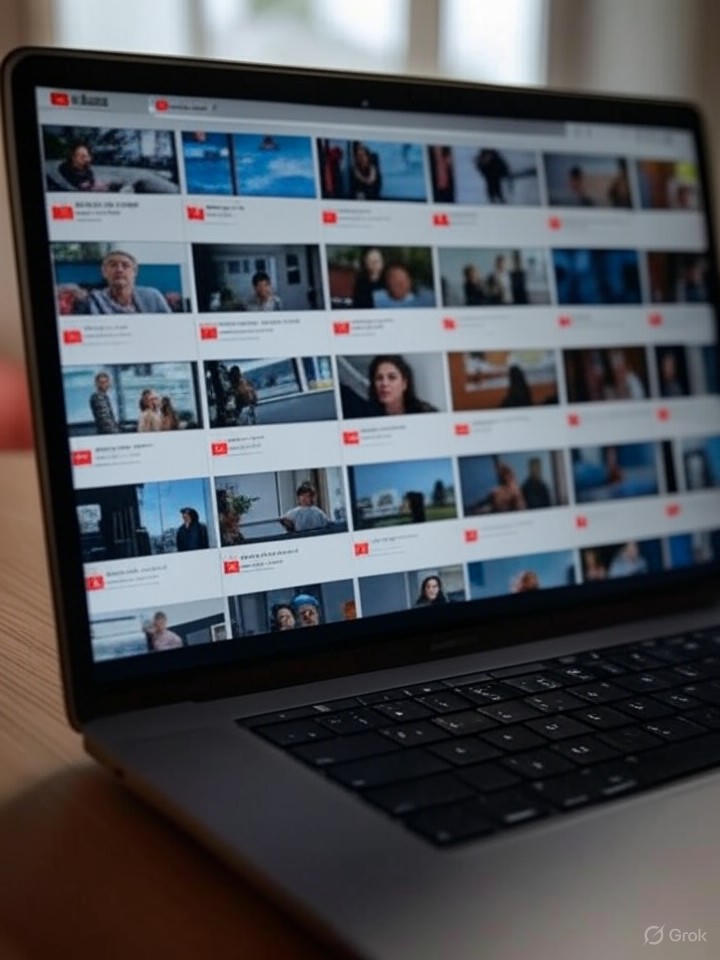
Complaints about the thumbnail size have proliferated on platforms like Reddit, where users in threads such as one from r/youtube describe the interface as resembling a browser optimized for poor eyesight, with massive previews overwhelming the screen and reducing content density. This feedback suggests a disconnect between YouTube’s design team and everyday users who prefer customizable grid views to scan more videos at once.
Similarly, the repositioning of playback controls has frustrated mobile users, as noted in reports from Tom’s Guide, where the compact layout compresses essential details like video titles and channel info, making navigation feel cramped. These issues are not isolated; Google Support forums, including a thread on YouTube Community, are rife with calls to revert changes, highlighting how such updates can alienate loyal audiences if not iterated upon quickly.
Pathways to Resolution
To address these grievances, experts recommend that YouTube implement user-configurable options, such as adjustable thumbnail sizes and revertible control layouts, drawing lessons from past redesigns that incorporated feedback loops. The MakeUseOf article specifically calls for fixes to these two elements, arguing that resolving them could transform the update from divisive to universally acclaimed.
Beyond immediate tweaks, this scenario underscores the challenges of scaling design in a global platform serving billions. As YouTube competes with rivals like TikTok and Netflix, refining these updates based on data from sources like Downdetector, which tracks outages and user-reported issues, will be crucial. Ultimately, the platform’s ability to iterate swiftly could determine its dominance in video streaming, ensuring that aesthetic evolution enhances rather than hinders user satisfaction.
Implications for Platform Evolution
For tech executives and designers, YouTube’s rollout serves as a case study in the perils of aggressive redesigns without sufficient beta testing. Insights from YouTube’s own community announcements reveal an intent to create “a more expressive and intuitive experience,” yet the backlash indicates a need for more granular user segmentation in A/B testing.
In the broader context, as platforms like YouTube integrate AI-driven personalization, addressing these foundational UI complaints will be key to maintaining trust. By heeding calls from publications like MakeUseOf and user communities, YouTube can refine its interface, potentially setting a standard for responsive design in the digital media sector.

