
YouTube’s Red Revolution: Decoding the Comment Section’s Fiery Facelift
In the ever-evolving world of digital interfaces, YouTube has once again stirred the pot with a subtle yet striking update to its comments section. As of early 2026, users opening the app on their mobile devices might notice an unexpected burst of red threading through the replies—a design choice that’s equal parts bold and bewildering. This isn’t just a cosmetic tweak; it’s a deliberate shift aimed at enhancing visual hierarchy and user engagement, according to insiders familiar with Google’s design philosophy. But as with many platform changes, this one has ignited a firestorm of opinions, from enthusiastic endorsements to outright outrage.
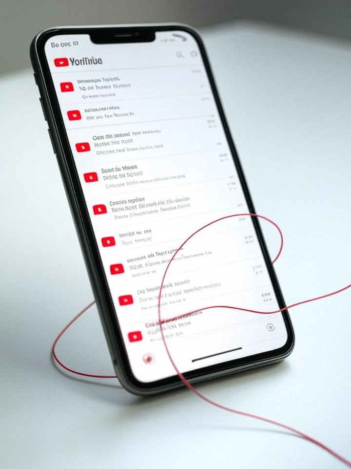
The redesign centers on a new visual “thread” that connects a commenter’s profile picture to their replies, rendered in YouTube’s signature red hue. This element, which debuted quietly in late 2025 and rolled out more broadly in January 2026, aims to make nested conversations easier to follow, borrowing cues from threaded discussions on platforms like Reddit. Reports from Android Authority detail how this red line snakes through the comments, creating a clear path amid the chaos of user interactions. It’s a small change, but in the context of YouTube’s massive user base—over 2.5 billion monthly active users—such alterations can ripple through the digital ecosystem.
Critics argue that the red thread feels intrusive, clashing with the app’s otherwise minimalist aesthetic. On desktop, the change is less pronounced, but mobile users, who account for the majority of views, are feeling the impact most acutely. This move comes amid a broader series of UI experiments by YouTube, including earlier threaded comment rollouts and logo color adjustments, signaling Google’s ongoing quest to refine how we consume and interact with video content.
User Backlash and the Psychology of Color
Feedback from the community has been swift and varied. Posts on X (formerly Twitter) reveal a mix of confusion and frustration, with some users decrying the red as “too vibrant” and disruptive to the viewing experience. One poster lamented how the intense shade overwhelms dark mode interfaces, making late-night scrolling sessions feel like staring into a neon sign. This sentiment echoes historical gripes; back in 2017, similar complaints arose when YouTube brightened its logo red, as noted in archived social media discussions.
Diving deeper, color theory plays a pivotal role here. Red is YouTube’s brand cornerstone, evoking energy and urgency, but its application in comments raises questions about accessibility. Experts in user experience design point out that high-contrast reds can strain eyes, particularly for those with visual sensitivities. A 2016 Quora analysis explained the logo’s red as a navigational cue, but extending it to interactive elements like threads introduces new challenges. Industry observers suggest this could be Google’s way of reinforcing brand identity, yet it risks alienating users who prefer subdued palettes.
Positive takes exist too. Some creators report that the red thread improves reply visibility, helping them spot fan interactions more quickly. This aligns with YouTube’s data-driven approach, where metrics like engagement time and comment volume guide updates. However, the divide highlights a broader tension in tech design: balancing innovation with user comfort.
Historical Context and Iterative Design
YouTube’s interface evolution isn’t new. In 2024, a Reddit-inspired threaded layout began testing, as covered in a Reddit thread from early 2025. That change mimicked forum-style nesting, but without the color emphasis. Fast-forward to 2026, and the red infusion builds on this, per updates from Tech Issues Today, which noted the rollout’s focus on mobile apps.
Comparisons to past redesigns are inevitable. The 2024 logo color shift, detailed in a Creative Bloq piece, went largely unnoticed at first but eventually sparked debates on subtlety in branding. Similarly, this comment tweak started as an A/B test, slipping under the radar until widespread adoption. Google’s parent company, Alphabet, has a history of such iterative tweaks—think Gmail’s Material Design overhauls or Android’s evolving UI paradigms—each aimed at boosting retention.
For industry insiders, this raises questions about data analytics in design. YouTube likely A/B tested the red thread extensively, monitoring metrics like scroll depth and reply rates. Yet, as one anonymous UX designer shared in recent X discussions, quantitative data doesn’t always capture qualitative discomfort, leading to post-launch adjustments.
Implications for Creators and Monetization
Beyond aesthetics, the redesign has tangible effects on content creators. Enhanced threading could encourage deeper discussions, potentially increasing watch time—a key factor in YouTube’s algorithm. Creators with large followings, such as those in gaming or tech reviews, might see more meaningful interactions, translating to higher ad revenue. A 2025 Social Media Today report highlighted how threaded comments, paired with audio replies, expand engagement tools.
However, if the red proves distracting, it could deter casual commenters, shrinking the pool of user-generated content that fuels virality. Monetization strategies hinge on this: more comments mean more data for targeted ads. Insiders speculate that Google is eyeing this as part of a larger push toward interactive features, like live polls or integrated shopping, to compete with rivals such as TikTok and Instagram Reels.
User feedback loops are crucial here. YouTube has historically responded to outcry—recall the 2024 interface backlash documented on Gadget Hacks, which prompted quick reversions. If criticism mounts, we might see toggles for color schemes or desaturated options in future updates.
Broader Industry Trends in UI Innovation
Looking across the tech sector, YouTube’s red thread fits into a pattern of visual cues dominating app design. Platforms like Discord and Slack use color threading for clarity, but YouTube’s scale amplifies the stakes. A recent Android Police article described the feature as “threading on thin ice,” capturing the precarious balance between helpful and overbearing.
Competitive pressures play a role too. With short-form video booming, YouTube’s 2026 search revamp, as outlined in WebProNews, includes filters to prioritize long-form content, indirectly boosting comment-heavy videos. This red update could be a subtle nudge to keep users lingering in discussions rather than swiping to the next clip.
For designers, this serves as a case study in minimalism versus emphasis. While some X users praise the change as a “welcome visual update” that aligns with modern aesthetics, others call it “inconsistent and weird,” per ongoing social chatter. The debate underscores how color choices can polarize, much like Apple’s controversial font shifts or Meta’s blue-heavy feeds.
Accessibility and Future Iterations
Accessibility remains a flashpoint. The stark red may not comply perfectly with WCAG guidelines for color contrast, potentially excluding color-blind users. Advocacy groups have long pushed for customizable UIs, and this could accelerate such demands. In a 2025 Gadget Pilipinas overview, similar filter overhauls were lauded for user-centric tweaks, suggesting YouTube might incorporate feedback mechanisms for color preferences.
Looking ahead, insiders predict integrations with AI for comment moderation, where red threads could highlight flagged content. This ties into Google’s broader AI ambitions, enhancing personalization without overwhelming the interface. If successful, it could set precedents for other Alphabet products.
Yet, the real test is longevity. Past changes, like the 2021 edited content borders discussed in X archives, evolved based on user input. YouTube’s agility in responding—evidenced by recent Shorts filters from a TheStreet report—bodes well for refinements.
Community Sentiment and Long-Term Impact
Social media sentiment, drawn from X posts, paints a nuanced picture: while some decry the red as “distracting” and “lowkey ridiculous,” others defend it as not “that bad” and fitting YouTube’s evolving style. This split mirrors broader trends in digital feedback, where nostalgia often clashes with progress.
For industry professionals, the lesson is clear: design decisions must anticipate diverse user bases. YouTube’s red thread, though controversial, exemplifies bold experimentation in a crowded market.
Ultimately, as the platform continues to adapt, this facelift could either fade into acceptance or prompt a colorful backlash, reshaping how we engage with online discourse.

