
Spotify moved fast to celebrate two decades in business. In mid-May the company swapped its familiar flat green icon for a glittering 3D disco ball on iPhones. The change lasted longer than many expected. Complaints piled up quickly. And on June 11 the fix finally arrived.
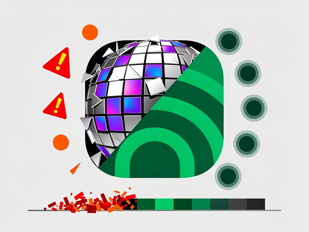
The streaming service launched the shiny new look as part of its anniversary events. Three curved black lines still cut across the center. Yet the mirror-ball texture and deeper green shade altered how the icon appeared at a glance. On home screens packed with apps it often blended into backgrounds or resembled an in-progress download. Users took to social platforms within hours.
“Alright, we know glitter is not for everyone. Our temp glow up ends soon. Your regularly scheduled Spotify icon returns next week.” So wrote the official Spotify account on X on May 17. The statement aimed to calm the storm. It did not fully succeed.
Critics called the design ugly. Some said it looked pixelated. Others complained it disrupted muscle memory built over years of tapping the same green circle. iPhone owners in particular noticed the issue because Apple’s home screen grid demands instant recognition. The disco ball failed that test for many.
Spotify had prepared for some reaction. Company representatives told outlets the icon was always temporary. Yet the backlash stretched the timeline. The promised return slipped. Twenty-five days passed before the update rolled out that restored the original 2D logo. 9to5Mac first reported the fix on June 11. The article noted that the delay likely stemmed from standard app review cycles at Apple combined with the volume of user feedback the company received.
Recent coverage confirms the resolution. Variety reported the quiet reversion to the classic icon after roughly a month of the disco ball version dominating iOS home screens. The piece highlighted how the experiment generated massive online conversation even as it frustrated loyal users.
Business Insider took a different angle. Its story argued the stunt achieved its underlying goal despite the hate. The temporary icon sparked millions of impressions, news articles, and social posts. Business Insider noted that Spotify replied directly to angry tweets and turned criticism into free publicity. The company never intended to make the disco ball permanent. That fact became the punchline once the complaints peaked.
Design experts weighed in during the uproar. They pointed to emotional attachment. Users form subconscious trust with familiar icons. Sudden changes, even playful ones, break that bond. The disco ball’s reflective surface and altered color profile exacerbated the problem on smaller phone displays. At thumbnail size the 3D effect lost clarity. It simply did not scan as Spotify.
Google even joined the fun. The search giant rolled out its own set of disco-ball-themed Android icons shortly after Spotify’s debut. TechCrunch covered the move as a lighthearted follow-on prank. It also reminded readers how quickly the original Spotify backlash had spread. Not every brand can afford such experiments. Spotify’s scale and cultural cachet gave it room to play. Still, the episode reveals limits.
Today’s updates on X show the story has closed for most. Android Authority, Hollywood Reporter, and others posted Friday that the hated icon is gone for good. Some users reported the old logo returned after a simple app update. A few holdouts on beta versions or slower rollouts still saw the disco ball into the weekend. Those cases appear isolated.
The affair offers lessons for product teams. Anniversary celebrations can generate buzz. Yet they risk alienating the very audience they aim to honor when changes touch core brand assets. Spotify listened. It reverted. And it did so without issuing a formal apology or lengthy blog post. The company simply shipped the update.
That quiet efficiency stands in contrast to the loud initial reaction. No major executive comments surfaced. No redesign committee was blamed. The disco ball came. It sparkled. It irritated. Then it vanished. Home screens look familiar again. For a music service that thrives on discovery and emotion, the brief visual disruption served as an unintended reminder. Familiarity carries real value.
Industry watchers will track whether the episode affects engagement metrics in coming weeks. Early signs suggest minimal long-term damage. Streams continued. Playlists grew. The conversation moved on. But the memory lingers. One poorly received icon generated more headlines than many feature launches. Brands chasing virality now have fresh data on the risks.
Spotify turns 20 at a moment when competition in audio has never been fiercer. Apple Music, YouTube Music, and podcast platforms press from all sides. In that context a short-lived visual experiment feels like low-stakes fun. Until it isn’t. The swift user revolt and eventual patch show how closely millions watch even small details. The green circle is back. The party is over. And the streaming giant moves forward with its most recognizable symbol intact.

