
Samsung is doing something unusual with its stock weather app. It’s making it beautiful.
A new update rolling out to Samsung’s Weather application — version 1.6.107.1 — introduces a sweeping visual overhaul that replaces the app’s previously utilitarian interface with animated full-screen backgrounds, repositioned UI elements, and a cleaner information hierarchy. The changes, first reported by Android Authority, may seem modest in isolation. A weather app is a weather app. But for those tracking Samsung’s design language across its software portfolio, the update is a telling indicator of where One UI is headed next.
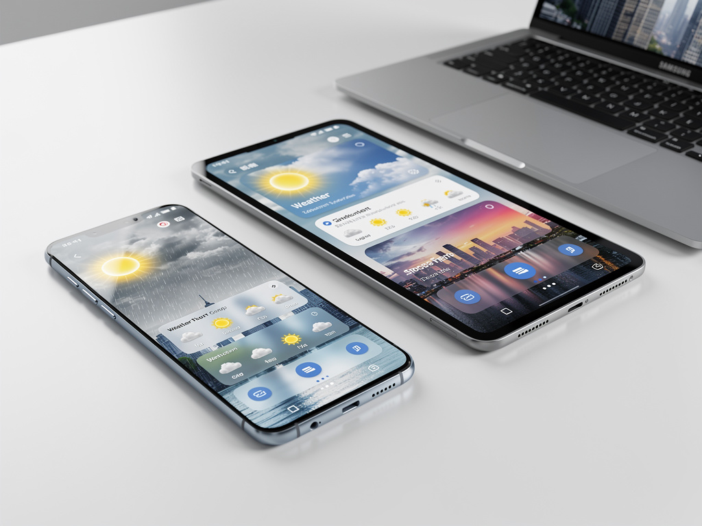
The most immediately noticeable change is the background. Samsung’s Weather app now displays animated weather scenes that fill the entire screen, replacing the more static and segmented layouts of prior versions. Rain produces visible droplets cascading down the display. Clear skies get a gradient treatment that shifts based on time of day. It’s a move that puts Samsung’s weather presentation closer to what Apple has offered on iOS for several years, and closer to what third-party apps like Weather Underground and Carrot Weather have long provided.
But the cosmetic layer is only part of the story.
Under the surface, Samsung has restructured how information is presented. The temperature reading and location name are now more prominently centered. Hourly and daily forecasts sit in redesigned cards with rounded corners and translucent backgrounds, giving the interface a layered, depth-forward appearance consistent with Samsung’s broader One UI 7 design direction. Scrolling behavior has been adjusted, too — weather details like humidity, UV index, and wind speed flow more naturally as users move down the page, rather than being crammed into a dense grid.
This matters because Samsung ships more smartphones globally than any other manufacturer. According to IDC’s Q1 2025 data, Samsung held approximately 19.7% of global smartphone shipments. Every design decision the company makes in its default apps reaches hundreds of millions of users, many of whom never install a third-party replacement. The stock weather app isn’t glamorous. It’s one of the most-opened apps on any phone. Samsung knows this.
The timing of this redesign is not accidental. Samsung has been steadily rolling out visual updates across its first-party applications in preparation for One UI 7, the company’s next major software layer built on top of Android 15. One UI 7 has been in beta since late 2024, and its design philosophy leans heavily into translucency, motion, and spatial depth — principles borrowed partly from Apple’s design playbook and partly from Samsung’s own evolving material design interpretation. The weather app update fits squarely within this trajectory.
Android Authority’s reporting noted that the update is arriving via the Galaxy Store, Samsung’s own app marketplace, rather than through a full system update. This distribution method allows Samsung to push interface changes to users on older One UI versions, not just those running the latest beta. It’s a strategic choice. Rather than gating visual improvements behind a major OS upgrade, Samsung can modernize the experience piecemeal. Users on One UI 6 or even One UI 5 devices can receive the refreshed weather app without waiting months for a system-level update to reach their carrier or region.
This decoupled update approach mirrors what Google has done with its own apps on Pixel devices, where the Google Weather app — itself recently redesigned — ships updates independently of Android version releases. Samsung appears to be adopting the same philosophy more aggressively across its app catalog.
Some context on why stock app design receives less attention than it deserves. Pre-installed applications define the out-of-box experience for the vast majority of users. Research from counterpoint and other analytics firms consistently shows that most smartphone owners use default apps for basic functions: weather, clock, calculator, calendar. The quality of these apps shapes perception of the entire device. A sluggish or ugly weather app doesn’t just reflect poorly on one piece of software — it colors how the user feels about the phone itself. Samsung has historically received criticism for bloated or inconsistent default app designs, particularly compared to Google’s Pixel-first approach or Apple’s tightly controlled iOS defaults. This weather app redesign suggests the company is taking that criticism seriously.
There’s a competitive dimension here too. Google’s own weather experience on Pixel phones received a significant facelift in 2024, introducing a frog-themed animated interface (carried over from the old Google Weather frog) alongside richer data visualization. Apple’s Weather app, inherited from its Dark Sky acquisition, continues to set the standard for visual polish and hyper-local precipitation data. Samsung’s update doesn’t match every feature of these competitors — notably, it still lacks the minute-by-minute precipitation forecasting that Apple offers — but it closes the aesthetic gap considerably.
And the aesthetic gap matters more than engineers typically want to admit. In a market where hardware specifications have largely converged — most flagship phones in 2025 offer similar cameras, similar processors, similar battery life — software design becomes one of the few remaining differentiators. Samsung’s willingness to invest design resources in something as mundane as a weather app signals a broader recognition that software polish is now a frontline competitive battleground.
The update also introduces minor functional improvements. Widget designs have been refreshed to match the new in-app aesthetic, ensuring visual consistency when users pin weather information to their home screens. Notification styling for weather alerts has been updated as well, with cleaner typography and more readable formatting. These aren’t headline features. They’re the kind of incremental refinements that, taken together, elevate the overall feel of a software platform.
Not everyone is thrilled. Early reactions on forums like Reddit’s r/samsung and posts on X suggest some users prefer the previous layout’s information density. The new design, with its larger visual elements and more generous spacing, necessarily pushes some data below the fold, requiring additional scrolling. It’s a classic design tension: visual appeal versus information efficiency. Samsung appears to have decided that first impressions and visual coherence take priority, betting that most users check the weather for a quick temperature and forecast glance rather than a detailed meteorological breakdown.
That bet is probably correct for the median user, even if power users disagree.
Looking at the broader One UI 7 trajectory, the weather app redesign is one data point in what appears to be Samsung’s most ambitious software design overhaul since the original One UI launch in 2018. That initial release was itself a significant departure from Samsung’s earlier TouchWiz and Samsung Experience interfaces, prioritizing one-handed usability and cleaner aesthetics. One UI 7 seems poised to represent a comparable leap, this time focused on visual sophistication and animation fluidity. The weather app is simply one of the first default applications to fully embody that new direction in a public release.
Samsung hasn’t issued a formal press statement about the weather app update specifically — the company rarely does for individual app refreshes. But the update’s rollout across multiple regions simultaneously, and its availability on the Galaxy Store for a wide range of devices, suggests this isn’t a soft test. It’s a deliberate, broad deployment.
For industry watchers, the signal is clear. Samsung is no longer content to let its default apps be functional afterthoughts. The weather app is the opening move. Expect the clock, calculator, calendar, and other stock applications to follow a similar design refresh cadence in the months ahead as One UI 7 moves from beta to stable release.
So the next time you check the forecast on your Galaxy phone and notice the rain actually looks like rain — that’s not a small thing. That’s Samsung telling you it cares about the details now.

