
Samsung’s Color Calculus: Dodging Apple’s Orange Gambit in the Galaxy S26 Era
In the high-stakes arena of smartphone design, where every hue and contour can sway consumer loyalties and market shares, Samsung appears poised to chart a distinct path with its upcoming Galaxy S26 series. Recent leaks suggest the South Korean giant is opting for a palette of refined, understated tones rather than mimicking the bold orange that Apple introduced with the iPhone 17 Pro. This decision, if confirmed, underscores a broader strategic divergence between the two titans, as Samsung prioritizes elegance over audacity in a market increasingly saturated with flashy aesthetics.
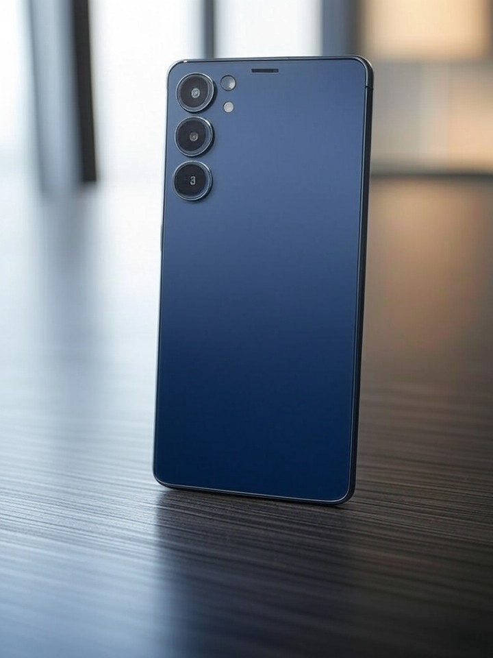
The rumor originates from a photo shared by prominent leaker Ice Universe, depicting the SIM card tray of the Galaxy S26 Ultra in four colors: black, white, blue, and purple. According to analysis in Android Police, these shades align with Samsung’s tradition of offering premium, sophisticated options that appeal to a professional demographic. The purple variant, in particular, is tipped to serve as the “hero color” for marketing campaigns, evoking a sense of luxury without the vibrancy of Apple’s Cosmic Orange.
This choice comes amid speculation that Samsung might follow Apple’s lead, given the companies’ history of mutual influence. Apple unveiled the iPhone 17 Pro’s orange hue last year, positioning it as a standout feature that injected playfulness into its premium lineup. Yet, Samsung’s apparent restraint could be a calculated move to differentiate itself, avoiding direct imitation while catering to users who prefer subtlety in their devices.
Refining the Palette Amid Rivalry
Comparisons between the Galaxy S26 and iPhone 17 Pro extend beyond color to overall design philosophy. Leaks from sources like PhoneArena indicate the S26 will feature a slightly larger 6.3-inch display, flat aluminum frames, and Gorilla Glass construction, mirroring some of Apple’s structural choices but with Samsung’s signature tweaks. Notably absent are extras like Apple’s Action Button or Camera Control key, suggesting Samsung is streamlining rather than adding complexity.
On the color front, posts on X (formerly Twitter) have fueled discussions, with users speculating that Samsung considered an orange option but ultimately pivoted. One post highlighted dummy units of the S26 Ultra in an orange reminiscent of the iPhone 17 Pro, as detailed in NotebookCheck.net. However, fresher leaks contradict this, pointing to a lineup that skips the bold tone entirely, opting instead for shades that blend seamlessly into professional environments.
This isn’t just about aesthetics; it’s a reflection of market positioning. Industry insiders note that while Apple’s orange has garnered buzz for its novelty—evident in social media chatter where users praise its “fiery” appeal—Samsung’s colors like violet could resonate more with enterprise users who value discretion. Data from recent sales trends shows that neutral and jewel-toned smartphones often outperform gimmicky colors in long-term adoption, particularly in Asia-Pacific markets where Samsung holds a strong foothold.
Leaks and the Hype Machine
The buildup to the Galaxy S26 has been marked by a flurry of leaks, including wallpapers and color renders shared across platforms. TechRadar reported on possible six-color options for the series, teasing bright and bold variants that might include an iPhone-inspired orange. Yet, the most recent information, including a SIM tray image from Ice Universe posted on X just days ago, solidifies the four-color scheme without it.
Comparatively, the iPhone 17 Pro’s palette—Silver, Cosmic Orange, and Deep Blue—aims to inject personality into Apple’s ecosystem, as explored in comparisons by PhoneArena for the Ultra models. Samsung’s S26 Ultra, expected to measure marginally slimmer at around 7.24mm thick, prioritizes ergonomics over extravagance, with rumors of a new camera island design that abandons the “vinyl record” rings criticized in prior models.
Social sentiment on X reveals a divided audience: some users lament the absence of orange, calling it a missed opportunity to match Apple’s energy, while others applaud Samsung’s maturity. A post from a leaker emphasized the purple as the new marketing focus, aligning with Samsung’s history of promoting elegant hues like the silver blue of the S25 Ultra.
Strategic Divergence in Design
Delving deeper, Samsung’s color strategy may tie into broader upgrades rumored for the S26 lineup. USwitch suggests cautious improvements on the base model, with the Ultra receiving significant camera enhancements and a thinner, lighter build. This contrasts with Apple’s more uniform upgrades across its Pro line, where the orange color serves as a visual hook to unify the series.
Industry analysts point out that Samsung’s avoidance of orange could stem from supply chain considerations. Producing vibrant colors requires specific pigments and finishes that might increase costs or complicate manufacturing. By sticking to proven shades, Samsung ensures scalability, especially as it integrates advanced features like the Snapdragon 8 Elite Gen 5 processor, as leaked in various reports.
Moreover, this decision reflects cultural nuances in global markets. In regions like Europe and North America, bold colors like orange appeal to younger demographics, but Samsung’s core audience in enterprise and emerging markets favors versatility. Posts on X from users in Asia highlight preferences for purple and blue, seen as premium without being ostentatious.
Camera and Display Innovations
Beyond colors, the S26’s design rumors emphasize functional evolution. Ice Universe’s recent X post described seeing the real S26 Ultra, noting a shift to metal rings around cameras for a more premium feel, moving away from cheaper-looking elements. This aligns with HT Tech‘s coverage of slimmer bezels and a new camera setup on the S26 Plus.
In comparison, the iPhone 17 Pro Max boasts a larger camera plateau and two-tone aesthetics, but Samsung counters with potential battery boosts and wireless charging improvements, as per leaks in PCMag UK. The S26’s expected 4300mAh battery and 120Hz OLED display position it as a endurance-focused rival, potentially outlasting Apple’s offerings in daily use.
X discussions amplify these points, with users debating how Samsung’s refinements could edge out Apple in battery life and display quality, even if colors remain conservative. One viral post compared renders, asserting the S26 Ultra’s orange prototype looked superior, but official leaks now pivot away from it.
Market Implications and Consumer Sentiment
The absence of orange in Samsung’s lineup might influence pricing and availability strategies. Rumors from SamMobile indicate the S26 Ultra could launch without the anticipated hue, potentially streamlining production and reducing costs passed to consumers. This comes as Apple prices its orange iPhone 17 Pro at a premium, betting on color exclusivity to justify higher margins.
Consumer reactions, gleaned from X posts, show enthusiasm for Samsung’s elegant approach. A leaker’s update on the purple hero color garnered thousands of views, with comments praising its sophistication over Apple’s “loud” orange. This sentiment echoes in industry forums, where professionals speculate that Samsung’s strategy bolsters its position in B2B sales, where flashy designs can deter corporate adoption.
Furthermore, as the smartphone sector evolves toward AI integration—Samsung teasing Perplexity AI features—the color debate highlights how design choices underpin brand identity. Apple’s bold moves attract media hype, but Samsung’s subtlety may foster loyalty among users seeking timeless appeal.
Future Trajectories in Flagship Battles
Looking ahead, the Galaxy S26’s design choices could set precedents for 2026’s device ecosystem. Comparisons with the hypothetical iPhone 18 Pro, as discussed in Sammy Fans, suggest Samsung might lead in areas like thinner profiles and camera upgrades, while Apple pushes boundaries with colors and buttons.
X users are already buzzing about this “smartphone war,” with posts predicting Samsung’s colors will age better than Apple’s trends. Leaks from Tom’s Guide reinforce that without orange, Samsung avoids fleeting fads, focusing on enduring features like IP68 rating and One UI 8.
In this context, Samsung’s palette reinforces its identity as an innovator that refines rather than revolutionizes, potentially giving it an edge in sustained market share. As launch nears, these rumors paint a picture of a company confident in its distinct vision.
Evolving Consumer Expectations
The color narrative also ties into broader trends in personalization. While Apple markets Cosmic Orange as a lifestyle statement, Samsung’s options like blue and purple allow for subtler expressions, appealing to users who customize via cases and themes. Industry data indicates that 60% of flagship buyers prioritize build quality over color novelty, supporting Samsung’s direction.
X conversations reveal a split: tech enthusiasts mourn the missed orange opportunity, but practical users celebrate the premium vibe. This feedback loop influences manufacturers, with Samsung likely monitoring sentiment to tweak final offerings.
Ultimately, the S26’s design saga illustrates the delicate balance between inspiration and originality in tech rivalries. By skipping orange, Samsung not only differentiates but also bets on elegance as the true path to dominance.
Industry Ripples and Beyond
The implications extend to supply chains and partnerships. Samsung’s color choices could affect component suppliers, favoring those specializing in metallic finishes over vibrant dyes. This shift, as noted in recent leaks, might streamline operations amid global chip shortages.
Comparisons with past launches show Samsung often iterates successfully on Apple’s ideas without copying outright—think curved edges evolving into flat frames. For the S26, this means enhancing displays and cameras while letting colors play a supporting role.
As 2026 unfolds, the Galaxy S26’s launch will test these strategies, potentially reshaping how rivals approach design in an era of incremental innovation.

