
The New York Times rolled out a modest but telling software update this week. Its flagship iOS app now incorporates Apple’s Liquid Glass material in two precise spots: the bottom navigation tab bar and the compact audio player that follows users while they read.
That’s it. No full redesign. No dramatic overhaul of article pages. Just those two elements now shimmer with the translucent, refractive quality that defines iOS 26. The restraint speaks volumes. Publishers guard their editorial presentation fiercely. They hesitate before handing visual control to a platform vendor’s latest aesthetic experiment.
Apple’s Bold Material Bet Meets Cautious Publisher Adoption
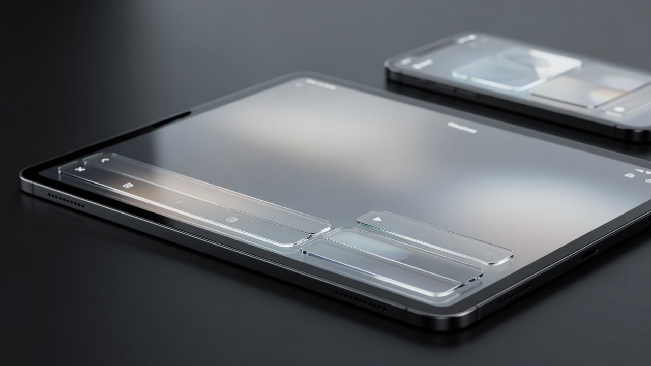
Apple introduced Liquid Glass at its 2025 developer conference. The company described the new interface element as a dynamic material that combines the optical qualities of glass with a fluidity only Apple can achieve. It reflects and refracts surroundings. It adapts color based on underlying content and lighting conditions. Elements bounce, jiggle, split apart during interaction.
“This is our broadest software design update ever,” said Alan Dye, Apple’s vice president of Human Interface Design, in the company’s official announcement (Apple Newsroom). “It combines the optical qualities of glass with a fluidity only Apple can achieve, as it transforms depending on your content or context. It lays the foundation for new experiences in the future and, ultimately, it makes even the simplest of interactions more fun and magical.”
The material draws inspiration from visionOS. Real-time rendering produces specular highlights that react to movement. Tab bars shrink and expand on scroll. Sidebars refract background imagery. In Apple Music, a droplet glides between sections as users tap tabs. Scroll through any compatible view and background images contort and bend behind the glassy controls.
Yet the effect isn’t universal. Many users find text harder to read against the shifting backgrounds. Apple iterated through multiple beta versions, adjusting intensity. The final balance, according to Wirecutter’s review, succeeds in blending ambition with daily use. Still, accessibility options exist. Reduce Transparency. Increase Contrast. Turn on Reduce Motion to eliminate the wiggly animations entirely (NYTimes Wirecutter).
The New York Times update follows a pattern seen across other high-profile apps. Microsoft refreshed Outlook for Mac with broader Liquid Glass treatment. Pocket Casts and WhatsApp expanded support more aggressively. iA Writer embraced the look alongside new icon treatments. These moves come as Apple reportedly requires full Liquid Glass compatibility from apps by September 2026.
But the Times chose minimalism. The tab bar gains that frosted, colorful glass mosaic quality. The mini player adopts similar transparency so story text and images claim more screen space. “This latest update keeps the focus on the story, giving more space on the screen to text, photos and videos,” the app’s version notes state in the App Store (Apple App Store).
And here’s the tension. Liquid Glass prioritizes visual vitality. It makes interfaces feel alive. Yet news consumption demands clarity above all. Readers want black text on clean backgrounds. They want photos to dominate without distortion. The Times appears to have threaded this needle by limiting the material to chrome elements that frame content rather than overlay it.
Industry observers note the slow rollout. Apple’s own apps adopted the look comprehensively from launch. Third-party developers have taken a measured approach. Some fear the refractive effects could undermine brand identity. Others worry about accessibility complaints or increased design complexity.
Recent discussions on X reflect divided opinions. Many praise the modern feel in system areas. Others call the icon changes fuzzy or distracting against certain wallpapers. The Times implementation has drawn limited but mostly positive early feedback since the July 1 update, with users noting cleaner article views.
Publishers face a strategic choice. Full adoption signals alignment with Apple’s platform vision. It may improve perceived performance on new devices. Partial implementation, like the Times approach, protects editorial presentation while still claiming compatibility. The latter feels safer for an organization whose app serves millions who arrive specifically for its journalism, not interface flourishes.
Apple’s pressure builds. The September deadline looms. More apps will follow. Whether they copy the Times’ light touch or pursue deeper integration remains an open question. One thing looks clear. Liquid Glass represents more than a visual refresh. It forces product teams to reconsider how their interfaces behave under constant motion and changing backgrounds.
The Times update arrives at an interesting moment. iOS 26 has been available for months. User adaptation continues. Some customize icons to full transparency for maximum glass effect. Others dial back the features for solid, bordered controls. The platform has never offered more visual personalization at the system level.
News organizations have long navigated platform changes. From responsive web design to dark mode to algorithmic feeds, adaptation is constant. Liquid Glass presents a different challenge. It alters the fundamental texture of the canvas on which stories appear. How publishers respond could influence reader perception of their digital products for years.
So far the Times has moved carefully. That caution may prove wise. Or it might leave the app looking dated as competitors embrace the full expressive range of the new material. Either way, the quiet update marks another step in Apple’s long campaign to reshape how all software looks and feels on its devices. Publishers can’t ignore it forever.

