
Introducing Google’s Calling Card
Google is venturing into personalized communication with a new feature called Calling Card, drawing clear inspiration from Apple’s Contact Posters on iPhones. This rollout, spotted in beta versions of Google’s Contacts and Phone apps, allows users to customize how incoming calls appear on their devices. Unlike Apple’s system, where users design posters that others see when they call, Google’s version flips the script: it lets you personalize the cards for your contacts, not your own outgoing profile.
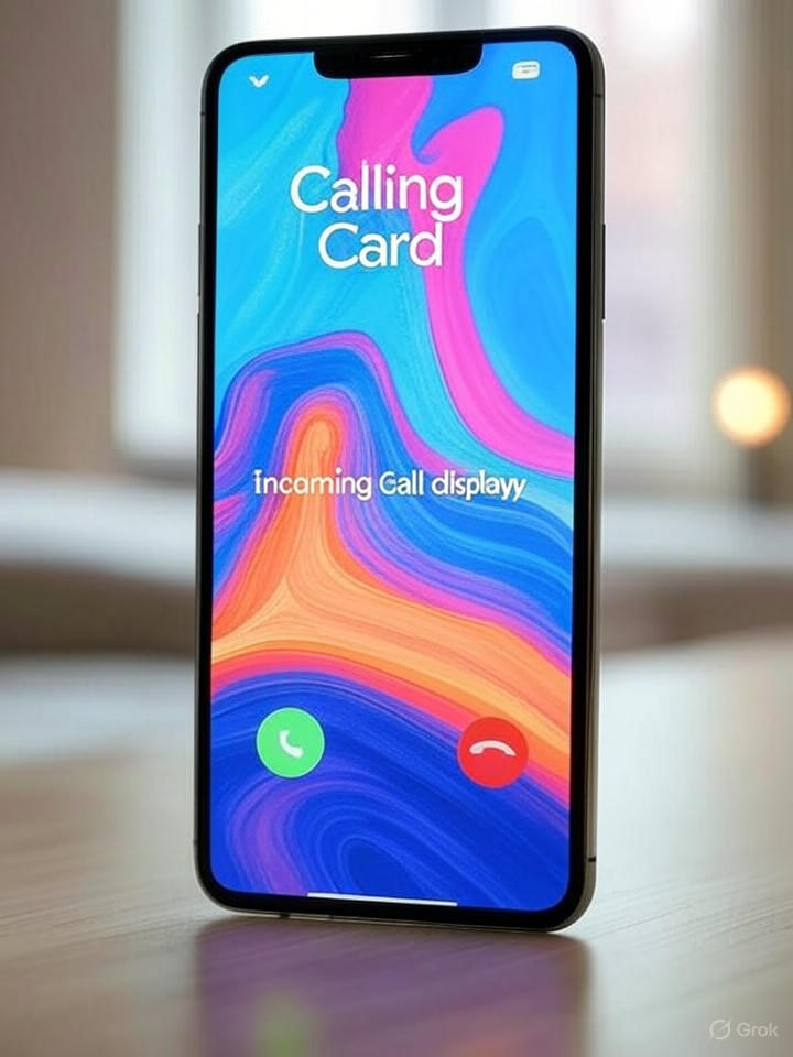
The feature emerged from recent app updates, enabling Android users to add photos, custom fonts, and colors to individual contacts. When that contact calls, a full-screen card displays the customized elements, enhancing the visual appeal of incoming calls. This development comes amid Google’s ongoing efforts to refine its ecosystem, blending functionality with aesthetic appeal.
Differences from Apple’s Approach
A key distinction, as highlighted by Lifehacker, is that Google’s Calling Card is recipient-controlled. You set it up for people in your address book, meaning the customization is private to your device. This contrasts with iOS, where Contact Posters are shared and visible to recipients, potentially raising privacy concerns that Google’s method avoids.
Industry observers note this as Google’s latest nod to iOS features, following adaptations like improved messaging and privacy tools. According to Engadget, the beta rollout began recently, with users reporting access in updated apps. It’s not yet widespread, but signals Google’s push toward more engaging user interfaces.
Technical Implementation and User Experience
Delving deeper, the Calling Card integrates seamlessly with Google’s ecosystem. Users can edit a contact’s profile in the Contacts app, selecting images from their gallery or taking new ones, then choosing from various font styles and color schemes. When a call comes in, the Phone app renders this card fullscreen, complete with the contact’s name and photo dominating the display.
This isn’t just cosmetic; it could improve usability, especially for quick identification during calls. 9to5Google reports that the feature is rolling out gradually, starting with beta testers, and may require the latest app versions. Early feedback suggests it’s intuitive, though some users wish for more sharing options akin to Apple’s.
Industry Implications and Future Potential
For industry insiders, this move underscores Google’s strategy to close the gap with Apple in user experience design. By borrowing and adapting features, Google aims to retain Android loyalty while attracting iOS switchers. Droid-Life emphasizes that unlike Apple’s shared posters, Google’s version prioritizes personalization without network dependencies, potentially reducing data usage.
Looking ahead, experts speculate on expansions, such as integration with video calls or broader sharing capabilities. Privacy remains a focal point; Google’s approach minimizes exposure, aligning with recent anti-theft and privacy features. As Android Authority notes, this could evolve into a more collaborative tool, but for now, it’s a subtle enhancement to Android’s calling interface.
Challenges and Competitive Edge
Challenges include ensuring compatibility across devices and carriers, given Android’s fragmented ecosystem. Not all phones may support fullscreen customizations optimally, potentially leading to inconsistencies. Moreover, while inspired by iOS, Google must innovate to avoid perceptions of mere imitation.
Ultimately, this feature positions Google to enrich everyday interactions, fostering a more personalized mobile experience. As rollouts continue, it will be telling how users and competitors respond, potentially influencing future developments in cross-platform communication standards.

