
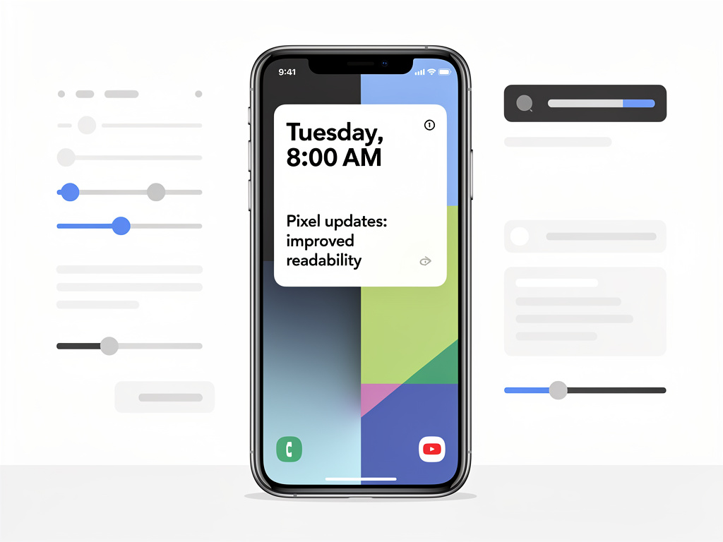
For years, Pixel smartphone owners have wrestled with a quiet but persistent frustration: Google’s At a Glance widget, the persistent home screen feature that surfaces contextual information like weather, calendar events, and travel updates, was often nearly impossible to read against certain wallpapers. That annoyance is finally being addressed, as Google rolls out a significant visual update that adds improved text contrast and readability to the widget — a change that may seem minor on paper but has meaningful implications for how millions of users interact with their devices every single day.
The update, first spotted and reported by Android Central, introduces enhanced text shadows and background treatments to the At a Glance widget, ensuring that the information it displays remains legible regardless of the wallpaper a user has selected. Previously, users who preferred lighter or more complex wallpapers found themselves squinting at white text that blended into the background, effectively forcing them to choose between aesthetic preference and functional readability. It was a compromise that felt particularly out of place on a device line that prides itself on intelligent software design.
A Simple Fix to a Surprisingly Deep Problem
The At a Glance widget has been a signature feature of the Pixel experience since its introduction. Positioned prominently at the top of the home screen, it serves as a contextual information hub, automatically surfacing relevant data such as the current weather, upcoming calendar appointments, flight boarding passes, traffic alerts, and even doorbell notifications from Nest devices. Google has steadily expanded its capabilities over the years, turning it into one of the most useful ambient information tools on any smartphone platform. Yet for all its intelligence, the widget has long suffered from a basic design shortcoming: poor text visibility.
The core issue was straightforward. The widget rendered its text in white with minimal or no shadow, which worked perfectly against dark wallpapers but became a liability against anything lighter. Users on forums and social media have complained about this for years, with some resorting to workarounds like using only dark wallpapers or installing third-party launchers that offered better text contrast options. As Android Central’s reporting highlights, the update now applies a more pronounced text shadow or adaptive background element that dynamically adjusts to maintain readability. For longtime Pixel users, this is the kind of quality-of-life improvement that feels both overdue and deeply satisfying.
Why Wallpaper Choice Matters More Than You Think
It might be tempting to dismiss a text shadow update as trivial, but in the context of smartphone user experience, wallpaper personalization is one of the most fundamental ways people make a device feel like their own. Google itself has invested heavily in wallpaper experiences on the Pixel line, from curated collections to AI-generated options introduced with recent Pixel models. The irony of offering beautiful, often light-colored wallpapers while simultaneously shipping a widget that becomes unreadable against them was not lost on the Pixel community. The fix aligns Google’s design philosophy more coherently: if the company is going to encourage personalization, the core software experience needs to accommodate it gracefully.
The timing of this update is also notable. Google has been on an aggressive push to refine the Pixel software experience ahead of the anticipated Pixel 10 launch later this year. Recent months have seen a flurry of updates to Pixel-exclusive features, including improvements to call screening, photo editing tools, and Gemini AI integration. The At a Glance readability fix fits into a broader pattern of Google polishing the details that differentiate Pixel phones from the broader Android ecosystem. It signals that the company is listening to user feedback, even on issues that might not generate headlines but significantly affect daily usability.
The Technical Mechanics Behind Adaptive Readability
While Google has not published a detailed technical breakdown of the changes, the update appears to leverage dynamic contrast adjustment — a technique where the system analyzes the colors and brightness of the underlying wallpaper and applies appropriate text treatments in real time. This could involve heavier drop shadows, semi-transparent background pills behind text elements, or a combination of both. Similar approaches have been used by Apple in iOS for years, where widgets and lock screen elements automatically adjust their appearance based on wallpaper content. For Google, implementing this on At a Glance brings the Pixel experience closer to parity with what iOS users have long taken for granted.
The implementation also raises questions about whether Google will extend similar adaptive readability features to other home screen elements. The Pixel launcher currently handles app labels and other text overlays with varying degrees of contrast awareness. A system-wide approach to dynamic text legibility would be a welcome evolution, particularly as Android continues to embrace customizable themes through Material You, Google’s design language that generates color palettes from user wallpapers. If the At a Glance update serves as a proof of concept, it could pave the way for a more holistic approach to text readability across the entire Pixel interface.
Community Response and the Power of Persistent Feedback
The reaction from the Pixel community has been overwhelmingly positive, though tinged with a sense of “finally.” On Reddit, X (formerly Twitter), and various Android enthusiast forums, users have expressed relief that they can now use their preferred wallpapers without sacrificing the utility of one of the Pixel’s most prominent features. Some users noted that they had specifically avoided certain Google-curated wallpapers because of the readability issue, creating an absurd situation where Google’s own aesthetic recommendations conflicted with its own software design. The fix resolves this tension and, for many, removes the last major friction point in their daily Pixel experience.
The update also underscores the importance of sustained community feedback in shaping product development. The At a Glance readability issue was not a bug in the traditional sense — it was a design choice that failed to account for the full range of user preferences. It took years of consistent complaints, forum threads, and social media posts to move the needle. For Google, which operates one of the largest user feedback ecosystems in the technology industry through its issue trackers and beta programs, the lesson is clear: even small design oversights can accumulate into significant sources of user dissatisfaction over time. Addressing them, even belatedly, builds trust and loyalty.
What This Means for the Broader Android Ecosystem
While the At a Glance widget is exclusive to Pixel devices, the underlying design principles at play here have implications for the wider Android ecosystem. Samsung, OnePlus, and other major Android manufacturers all offer their own home screen widgets and contextual information displays. The challenge of maintaining text readability across diverse wallpaper choices is universal, and Google’s approach could serve as a reference implementation for other OEMs. Moreover, as Google continues to push more Pixel-exclusive features into the broader Android Open Source Project (AOSP) over time, adaptive contrast techniques developed for At a Glance could eventually benefit non-Pixel devices as well.
The update also arrives at a moment when the smartphone industry is increasingly focused on ambient and glanceable information. With the rise of always-on displays, lock screen widgets, and AI-powered notification summaries, the ability to present information clearly and legibly at a quick glance — without requiring the user to tap, swipe, or squint — is becoming a key differentiator. Google’s investment in making At a Glance more readable is not just a cosmetic fix; it is an investment in the fundamental interaction model that will define the next generation of smartphone experiences. For Pixel owners, it means one less compromise. For the industry, it is a reminder that the details matter — sometimes more than the features themselves.
As Google continues to iterate on the Pixel software experience in the lead-up to its next hardware cycle, the At a Glance readability improvement stands as a small but meaningful example of how thoughtful design refinements can have an outsized impact on user satisfaction. It is the kind of update that won’t appear in any keynote presentation or marketing campaign, but it will be felt every single time a Pixel owner glances at their home screen — which, for most people, is hundreds of times a day.


 WebProNews is an iEntry Publication