
Google has spent the past two years methodically reshaping one of its most-used but least-noticed interfaces. The account switcher that sits behind the profile icon in dozens of first-party Android apps no longer looks or behaves the same way. What began as compact UI experiments in 2024 has become a full-screen experience rolling out to Gmail, Maps, Drive and more than a dozen others.
From overlay to full takeover
The shift started quietly. An August 2024 APK teardown first hinted at strings suggesting a cleaner layout modeled on the web version. Android Authority reported the initial findings. By December 2024 the changes appeared in Gmail. 9to5Google documented the move from a floating overlay that preserved background context to a true full-screen page.
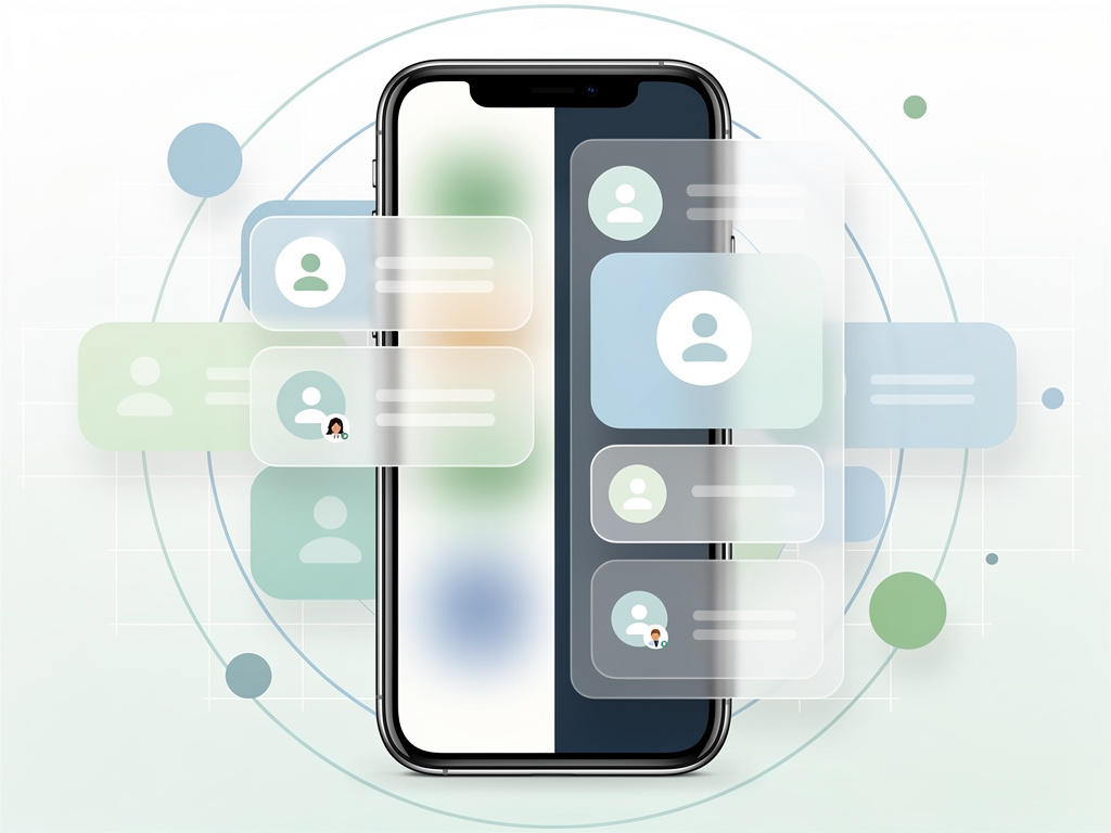
That new page uses Dynamic Color theming pulled from the device. An X sits in the top right corner. Users see their email first, then a large circular avatar, a greeting that reads “Hi, [name]!”, and a prominent “Manage your Google Account” button. Below comes the switcher list itself. It collapses neatly. Storage usage appears in Gmail. Privacy and terms links anchor the bottom. The design gives breathing room. It also removes any sense of place within the original app.
Power users kept one familiar shortcut. Swipe up or down on the profile picture in the corner and accounts change without opening the full interface. The gesture dates to 2019. Google left it untouched. Smart move. Many professionals juggle three, four, even five accounts. They don’t want friction.
Early signs pointed toward simplicity. In May 2025 Android Authority spotted tighter code in Google Drive version 2.26.217.9. The salutation disappeared. Profile photos shrank. Email and photo merged into a collapsible header. The “Manage your Google account” button dropped lower. “Switch account” text vanished. The camera icon for profile pictures became a pencil that now leads to the full personal info page instead of a direct photo editor. Scrolling in content-heavy apps like Play Store or Gemini stood to improve.
But the direction evolved. What began as compaction became expansion. By spring 2025 the fullscreen version reached Maps. Android Authority noted users starting to see it there. Translate, Wallet and Tasks followed in May. Specific version numbers told the story: Translate 9.9.58, Wallet 25.20, Tasks 2025.05.19. The pattern held. Google tested, observed, then widened the net.
By June 2025 the list stood at 16 apps. 9to5Google published the full accounting: Gmail, Calendar, Chat, Docs, Drive, Home, Keep, Maps, News, Sheets, Slides, Tasks, Translate, TV, Wallet, and Pixel Tips. Most Workspace apps had joined. In navigation-heavy titles the menu added a “More from [app]” heading so users remembered their location. The intent looked clear. One consistent account experience across every Google property on Android.
Critics didn’t hold back. The same 9to5Google piece called the fullscreen approach unnecessary. It pulls people completely out of their workflow. Spatial awareness disappears. Yet the article conceded the swipe shortcut still worked. Not everyone lost quick access.
The redesign reflects broader priorities. Google wants parity between mobile and web. Account management on the desktop already uses a similar expanded card. Consistency reduces training time for enterprise users. It also simplifies internal code. One component instead of per-app overlays. Engineers gain breathing room. Users get predictable behavior.
But predictability comes with trade-offs. In Wallet or Tasks the old overlay felt lightweight. The new page feels heavier. Some professionals switch accounts dozens of times daily. Extra taps add up. Google appears to have bet that the visual clarity and added options outweigh those extra milliseconds. Time will test that wager.
No major functionality changed. Users still add accounts, manage them on device, or jump between profiles. The storage indicator, when present, offers the same data. The pencil icon simply routes through a richer profile page. These count as refinements more than reinvention. The real story sits in the interface itself.
Rollout continues. Not every app has the update yet. Play Store received its version later, as noted in an August 2025 teardown that later saw live deployment. YouTube on Android TV gained related prompts at launch. The account system touches every corner of Google’s mobile presence. Changes propagate slowly to avoid disruption.
Professionals who rely on multiple Google identities notice first. Enterprise admins appreciate the uniformity. Consumer users see a prettier screen. Both groups now operate inside an interface built for the long term. Google rarely redoes core UI elements this thoroughly without data to back the decision.
The account switcher once felt like an afterthought. A small menu tucked in the corner. Now it commands the entire display. That elevation signals how central identity management has become. With Workspace adoption rising and personal accounts multiplying, the old compact overlay no longer sufficed. Google responded with space, consistency, and a touch of personality in the greeting.
Whether the fullscreen version sticks or sees further tweaks remains open. Early feedback mixed praise for design with frustration over context loss. Google has adjusted account interfaces before. The swipe gesture survived. Other elements might too. For now the direction holds. One account view to rule them all across the Android apps millions open every day.

