
In the ever-evolving world of mobile messaging, Google is once again tweaking its flagship app to enhance user experience, this time focusing on how links are previewed and shared. A recent beta version of Google Messages reveals a substantial redesign of link previews, shifting from the familiar card-style format to a more streamlined, integrated approach that prioritizes brevity and visual appeal. This move comes as part of Google’s broader efforts to modernize its Android ecosystem, responding to user feedback on clutter and usability in conversations.
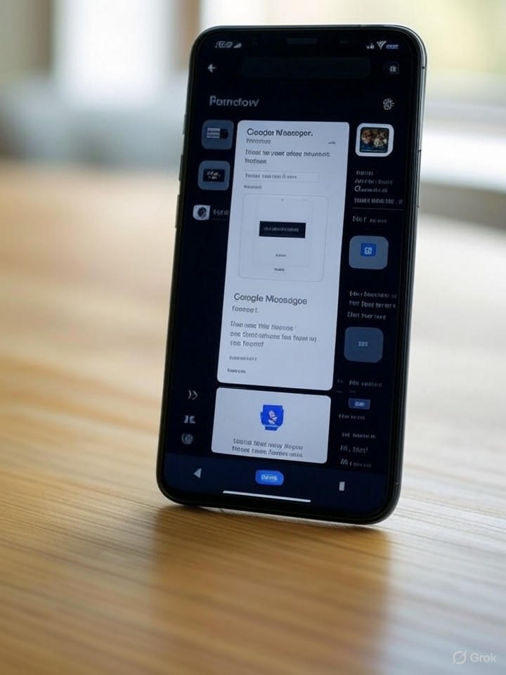
The changes, spotted in the app’s latest test build, eliminate the expansive previews that often dominated chat threads, replacing them with compact snippets that include just the domain name, a brief title, and a small thumbnail. This redesign aims to reduce visual noise, making threads feel less overwhelming, especially in group chats where multiple links are shared rapidly.
Evolving Design Philosophy in Messaging
Industry observers note that this overhaul aligns with Google’s Material You design language, which emphasizes personalization and efficiency. By condensing previews, Google Messages could improve load times and data usage, particularly beneficial for users on slower networks or with limited data plans. However, some beta testers have expressed concerns that the slimmed-down format might obscure important context, potentially leading to more accidental clicks on dubious links.
Drawing from insights in a report by Android Police, the redesign also introduces subtle animations and color adaptations that match the user’s theme, fostering a more cohesive Android experience. This isn’t Google’s first foray into refining previews; earlier iterations, as detailed in a 2018 teardown by the same publication, added basic link previews amid preparations for features like dark mode.
Implications for User Engagement and Security
For app developers and UX designers, this shift underscores a growing trend toward minimalism in mobile interfaces, where information density must balance with readability. Competitors like Apple’s iMessage have long used rich previews, but Google’s approach may set a new standard for Android by integrating AI-driven summaries in future updates, potentially pulling from Google’s Gemini models to provide safer, context-aware snippets.
Security experts highlight another angle: condensed previews could inadvertently heighten phishing risks if users rely less on visible URLs. As noted in discussions from Android Authority, the redesign prompts users to scrutinize domains more carefully, which might encourage better digital hygiene, though it demands vigilance from Google’s end to flag malicious links proactively.
Broader Ecosystem Integration and Future Prospects
This update doesn’t exist in isolation; it’s part of a piecemeal rollout of Material 3 Expressive elements across Google apps, as evidenced by similar redesigns in Gmail and Calendar. Beta users have reported staggered implementations, suggesting Google is testing waters before a wide release, possibly tied to Android 16.
Looking ahead, insiders speculate that these changes could extend to web versions of Messages, enhancing cross-device consistency. Publications like Android Central have tracked how such expressive redesigns aim to make Android feel more dynamic, potentially boosting user retention in a market dominated by WhatsApp and Telegram.
Challenges and Competitive Pressures
Yet, not all feedback is positive. Some users miss the detailed previews for news articles or product links, arguing that the new format sacrifices informativeness for aesthetics. Google must navigate these trade-offs carefully, especially as Samsung phases out its own Messages app in favor of Google’s, per insights from Android Police analyses.
Ultimately, this redesign reflects Google’s commitment to iterative improvements, balancing innovation with practicality. As the beta evolves, it will be telling to see how these changes influence daily messaging habits and whether they propel Google Messages ahead in the competitive arena of communication tools.

