
In the ever-evolving world of mobile navigation, Google Maps continues to refine its user interface, aiming to enhance usability and efficiency for Android users. Recent developments, as detailed in a report from Android Authority, reveal upcoming tweaks that promise to make the app more intuitive and less intrusive. These changes build on a series of updates that have progressively shifted the app toward a more map-centric design, ensuring that critical information doesn’t obscure the primary view.
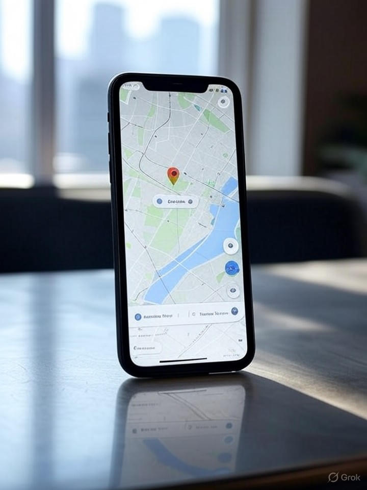
At the heart of these modifications is an emphasis on minimizing screen clutter. For instance, the integration of bottom sheets for displaying details like location info or directions allows users to access data without fully covering the map. This approach, which began rolling out in previous iterations, is now being expanded to more elements within the app, according to insights from Android Authority‘s coverage of the sheets UI redesign.
Evolving Design Philosophy
Google’s strategy appears rooted in user feedback, where complaints about wasted screen space have driven innovations like the move away from full-screen overlays. A July 2024 update, highlighted in another Android Authority piece, introduced redesigns that keep the map visible at all times, even during interactions with menus or search results. This not only improves navigation flow but also caters to multitasking users who rely on quick glances at the map while planning routes.
Looking ahead, the latest previews suggest enhancements to color schemes and iconography, potentially adopting a teal accent to replace the traditional blue, as noted in a December 2024 report from Android Authority. Such visual refreshes aim to align Maps with broader Android design languages, like Material You, fostering a cohesive ecosystem experience.
Integration with Broader Ecosystems
Beyond the core app, these UI changes extend to integrated platforms such as Android Auto and Wear OS. For Android Auto, recent fixes have addressed user frustrations with map presentation, reverting to more centered and less obstructive layouts, per a February 2025 update covered by Android Authority. This responsiveness underscores Google’s commitment to cross-platform consistency.
On Wear OS, a bold visual overhaul incorporating expressive Material 3 elements is in testing, as spotted in a June 2025 article from Android Authority. These adaptations ensure that Maps remains functional on smaller screens, with simplified interfaces that prioritize glanceable information for on-the-go users.
Implications for Developers and Users
For industry insiders, these UI evolutions signal Google’s push toward more adaptive and context-aware interfaces, potentially influencing app development standards across the Android platform. By leveraging tools from the Google Maps Platform, developers can integrate similar features, enhancing geospatial analytics and 3D mapping in their applications.
Users stand to benefit from reduced cognitive load, with features like offline maps—detailed in a practical guide from Android Authority—complementing the UI improvements for seamless travel experiences. As these changes roll out, they could set new benchmarks for navigation apps, emphasizing visibility and efficiency in an increasingly mobile world.
Future Prospects and Challenges
While promising, the iterative nature of these updates raises questions about rollout timelines and compatibility. Early adopters have reported inconsistencies, such as the teal color shift not appearing uniformly, echoing sentiments in a September 2023 Android Police article on initial redesign tests. Google must navigate these hurdles to maintain user trust.
Ultimately, these UI enhancements reflect a broader trend toward user-centric design in tech, where functionality meets aesthetics. As Google continues to refine Maps, industry watchers will be keen to see how these changes impact engagement metrics and compete with rivals in the mapping space.

