
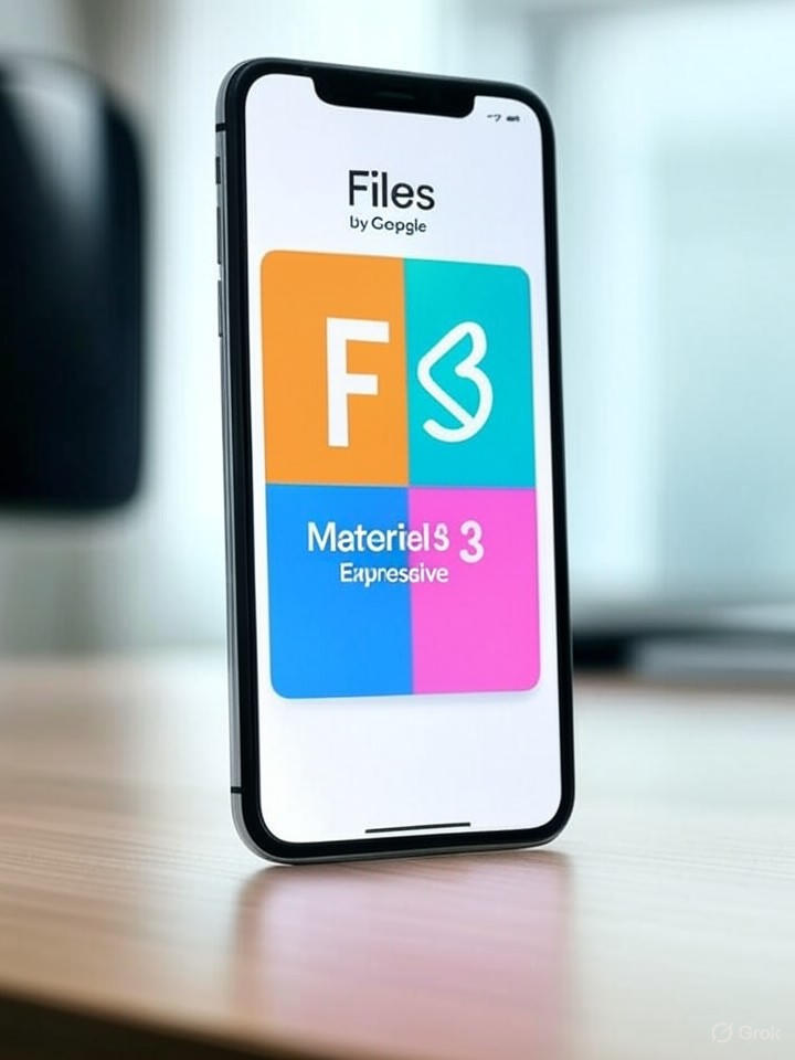
In the ever-evolving world of mobile software, Google has once again demonstrated its commitment to refining user interfaces, this time with a significant update to its Files by Google app. The redesign, rooted in the company’s Material 3 Expressive design language, introduces bolder visuals and more intuitive interactions, marking a departure from the app’s previously understated aesthetic. This overhaul isn’t just cosmetic; it aligns with Google’s broader push to make its apps more engaging and accessible, particularly on Android devices.
Users familiar with Files by Google will notice immediate changes upon updating, including vibrant color accents, larger touch targets, and pill-shaped buttons that emphasize key actions like sharing or deleting files. These elements draw from Material 3 Expressive principles, which prioritize expressiveness and dynamism over the flatter designs of past iterations. According to a detailed breakdown in Android Police, the update began rolling out widely on August 13, 2025, transforming the app’s interface into something more playful yet functional, with categories like images, videos, and documents now highlighted in eye-catching ways.
The Evolution of Material Design
This isn’t an isolated tweak—it’s part of a systematic refresh across Google’s app portfolio. Material 3 Expressive, first teased in Android 16 betas, emphasizes emotional resonance through subtle animations and adaptive layouts, aiming to make file management feel less like a chore and more like an extension of the user’s daily flow. Insiders point out that the redesign enhances discoverability, such as by surfacing recent files more prominently and integrating search filters directly into the main screen, reducing taps needed for common tasks.
However, the update comes with trade-offs. As noted in a report from Android Authority, while the new look adds visual flair with colorful icons and rounded edges, it might increase cognitive load for users accustomed to minimalist interfaces. Early adopters on devices like Pixel phones have reported smoother navigation, but some express concerns over battery implications from enhanced animations, though Google has optimized these for efficiency.
Broader Implications for Google’s Ecosystem
The Files by Google redesign mirrors similar updates in other apps, such as Google Photos and Drive, where Material 3 Expressive has introduced persistent indicators and redesigned menus. For instance, 9to5Google highlighted how Photos now features a bold backup status bar, ensuring users stay informed without disrupting their experience. This consistency suggests Google is standardizing its design language to foster a cohesive Android ecosystem, potentially boosting user retention amid competition from iOS’s polished interfaces.
From an industry perspective, this move underscores Google’s strategy to leverage design as a differentiator in a saturated market. By making apps like Files more “expressive,” the company is betting on emotional engagement to drive daily usage, especially in emerging markets where Files by Google serves as a primary file manager for budget Android devices. Analysts see this as a response to user feedback demanding more personality in apps, with the redesign potentially influencing third-party developers to adopt similar Material guidelines.
User Adoption and Future Prospects
Rollout data indicates the update is server-side, meaning not all users will see it immediately, but it’s expected to reach most by the end of August 2025. Feedback from beta testers, as covered in Android Headlines, praises the modern feel, with bolder fonts and spacing improving readability on larger screens. Yet, for enterprise users managing sensitive files, the added vibrancy could raise questions about professionalism, prompting Google to offer customization options in future iterations.
Looking ahead, this redesign positions Files by Google as a testbed for Material 3 Expressive’s scalability. If successful, it could accelerate similar overhauls in apps like Messages and Calendar, already in testing phases. Google executives have hinted at deeper integrations with AI-driven features, such as automated file categorization, which could pair seamlessly with the new visual cues. For industry insiders, the key takeaway is clear: design innovation remains a cornerstone of Google’s mobile dominance, blending aesthetics with utility to keep users locked into its ecosystem.
Challenges and Competitive Edge
Not everything is seamless, though. Some reports, including insights from Android Police on related search enhancements, suggest that while filters are now more accessible, swiping through categories might feel cumbersome on smaller devices. This highlights a potential pitfall in Google’s one-size-fits-all approach, where expressive elements must balance universality across diverse hardware.
Ultimately, the Files by Google redesign exemplifies how subtle UI shifts can have profound impacts on user behavior. By infusing boldness into a utilitarian app, Google is not just updating an interface—it’s redefining how billions interact with their digital files, setting a benchmark for the next wave of Android app evolutions. As competitors like Apple refine their own ecosystems, Google’s expressive pivot could prove a strategic masterstroke, ensuring its apps remain fresh and indispensable in an increasingly visual digital world.

