
Google just handed calendar users something they have begged for years. The company announced an expansion of event color options that replaces a rigid set of 11 predefined shades with up to 200 custom choices. The update arrived in an official post on the Google Workspace Updates blog yesterday.
Users can now pick from 24 default colors across web, mobile apps, and the Calendar API. On the web or through the API, a full RGB color picker opens even more possibilities. Google Workspace Updates described the change as fulfilling “a long-standing feature request from both business and personal users.”
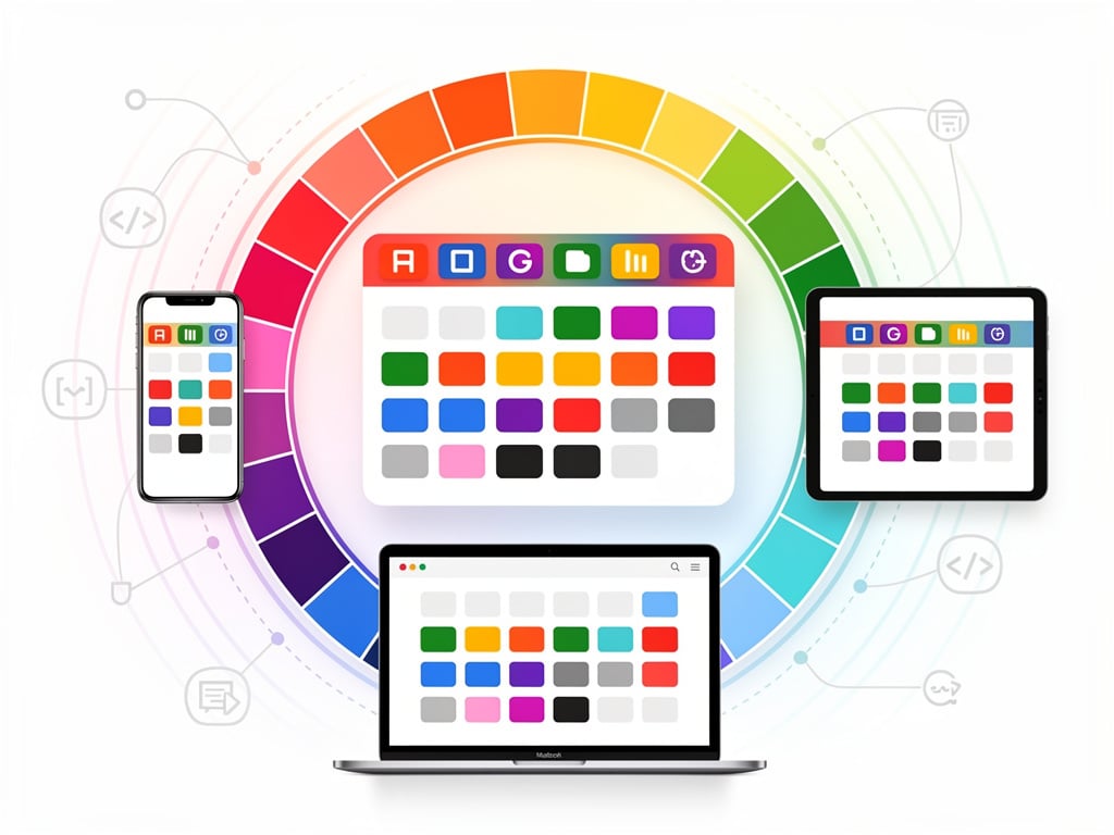
The difference feels immediate. Busy professionals who once squinted at overlapping blocks of similar blues and greens can now assign distinct hues to client calls, internal reviews, personal errands, or urgent deadlines. Visual organization becomes sharper. Scanning a week at a glance turns less guesswork and more instant recognition.
But the story runs deeper than a simple palette upgrade. For more than a decade, Google held firm to those 11 colors for individual events. Users could set custom colors for entire calendars. Individual events stayed locked in the limited set. Support forums filled with complaints. Chrome extensions popped up to fill the gap. One popular extension, “More Colors for Calendar,” let users inject custom hex values directly. Others followed. The demand was clear. Google finally listened.
The timing reveals broader shifts inside the company.
Product teams appear to have revisited small but persistent pain points across Workspace apps. This color expansion lands alongside other quality-of-life tweaks. It signals that even mature products can still earn loyalty through thoughtful refinements rather than flashy new modules. And the rollout shows care. Rapid Release domains begin receiving it today. Scheduled Release domains follow on June 29. No admin controls required. The feature turns on by default for all Google Workspace customers, Workspace Individual subscribers, and personal account holders.
Abner Li at 9to5Google called it “a nice quality-of-life update.” He noted how quickly users exhausted the old 11 options. His reporting captured the exact language from Google’s announcement while adding context on the parallel Google Voice AI notes feature. The piece underscores how long users waited.
Earlier coverage from The Verge highlighted the same frustration. Writers there observed that “pretty easy to blast through the previous 11 color presets.” The limitation forced many to rely on calendar-level colors or third-party tools. That workaround era ends now.
Developers gain too. The Calendar API supports the new custom colors. Teams that sync events programmatically or build internal tools can assign precise shades without compromise. Enterprise users who color-code projects by department, priority, or status will find new precision. One support thread from years ago captured the old pain perfectly: users could customize calendar defaults but not individual events in the way they wanted. That gap closed.
Yet questions remain. Will the expanded palette create its own clutter? Some users already worry about too many options leading to inconsistent schemes across teams. Google offers no built-in templates or suggested palettes yet. Organizations may need to establish their own guidelines. Training sessions could become necessary in larger companies where shared calendars drive coordination.
The mobile experience matters here. Both Android and iOS apps receive the 24 default colors immediately. The full RGB picker stays web-first for now. That split makes sense from an interface perspective. Picking exact shades works better with a mouse and larger screen. Still, power users on phones may feel the limitation until full parity arrives.
Look back at the history. Google Calendar launched with basic functionality. Color coding came early but stayed simple. Over time the product added layers: smart suggestions, integration with Gmail, Goals, and now this. Each addition addressed a specific friction. The color update feels like the latest chapter in making the calendar an extension of how people actually think about time.
Reactions on X arrived quickly. One user posted a screenshot of the announcement and simply wrote “I love @googlecalendar and this is a welcome addition.” Others shared the 9to5Google story. The sentiment leans positive. After years of extensions and workarounds, native support lands as relief.
Productivity experts have long preached the value of visual cues. Color coding reduces cognitive load. It speeds decision making. A red block for high-priority items. A calm blue for focus time. Distinct shades for different clients. The old 11 colors forced compromises. Meetings with similar urgency blended together. Now distinction becomes possible without forcing an entire calendar into one shade.
Google stopped short of unlimited colors. The cap at around 200 custom options prevents performance issues or visual chaos. That practical boundary shows thoughtful engineering. The company learned from other products where unlimited customization created support headaches.
So what comes next? Further integration with labels seems likely. The help center already points to using labels to track entries. Custom colors pair naturally with that system. Future updates could tie colors to keywords or automatic categorization. For now, the manual choice gives users control they lacked before.
This change won’t make headlines like a major AI feature. It lacks the drama of new hardware. But for millions who live inside their calendars, it removes a daily annoyance. The kind of small frustration that accumulates. Google eliminated it. Quietly. Effectively.
The rollout continues over the next weeks. Users should see the new palette appear without any action. Those who rely on the API may need to test updated integrations. Most will simply open their calendar one morning and notice more choices when editing an event. A small moment. A meaningful one.
In the end, calendars succeed when they disappear into the background of daily work. Better visual tools help that happen. They reduce the mental effort of parsing schedules. They let users focus on what matters inside the blocks rather than the blocks themselves. Google took a step closer to that ideal.

