Today both Google and Bing released some health-related map applications. These releases coincide with the Institute of Medicine and the U.S. Department of Health and Human Services (HHS) hosting their Community Health Data Forum event.
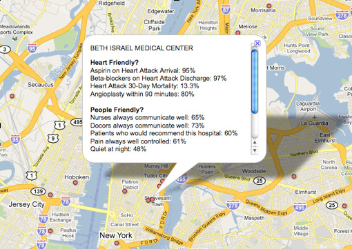
Google’s contribution includes a Google Fusion Tables project and customized map showing information from HHS. For example, you can see a map of "heart friendly" and "people friendly" hospitals.

"It’s important to note that the science behind measuring the quality of hospitals and health care in general is still evolving, so we can’t make definitive conclusions from this data," says Google’s Chief Health Strategist, Roni Zeiger, MD. "However, this kind of transparency will lead to discussion, questions, and analysis which we hope will improve choices and outcomes."
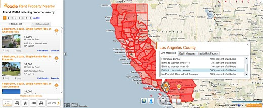
Microsoft launched a Bing Maps app called Bing Health maps. This also uses data from HHS. It provides stats for the U.S. states by county.

"Bing Health Maps is very straightforward to use – (1) Select a state and, (2) Select a Community Health Indicator," explains Bing’s Chris Pendleton. "The map will re-center on the respective state and color-code the counties within that state based on unit-based reporting. You can select health indicators such as Birth Indicators (low birth weight, premature births, births to women under 18, etc.); Death Measures (homicide, lung cancer, stroke, etc.) or Health Risk Factors (obesity, smokers, high blood pressure, etc.). If the opacity doesn’t suit your fancy there’s a slider to increase or decrease it."
"Once the map is loaded with the respective counties shaded you can click on any county to get all of the factors listed under the Community Health Indicator list all in one popup for that county," continues Pendleton. "This app is jam-packed with information! Let’s say you’re looking to move California because you think everyone there is a health nut. Turn on the Bing Health Maps to see which counties are most healthy. Then, when you’re deciding to be a SoCal or NorCal person (the war wages on) you can fire up the Oodle Map App to check out rentals in the respective area. Or, check out the Twitter Map App and filter based on keywords like “running,” “hiking,” or “surfing” and you’ll finally find out that SoCal is just better since people aren’t Tweeting – they’re actually out running, hiking and surfing."
More about the HHS Community Health Data Initiative can be found here.


 WebProNews is an iEntry Publication