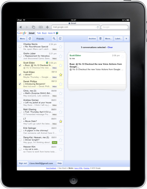
Google has released a new "stacked card" interface for Gmail on the iPad. What this does is allow for selecting and managing multiple conversations.
"In the past, performing actions on selected conversations was awkward," says Google Mobile software engineering intern Liam Asher Segel-Brown. "There were two similar toolbars on the screen: one on the bottom left and the other on the top right. The former affected the selected conversations, while the latter affected the currently open conversation. Since the toolbars’ buttons looked similar, it was easy to mistakenly use the wrong toolbar. Sound confusing? It was."

"In the new interface, selected conversations are displayed stacked on the right panel for easy organizing, archiving or deleting," he says. "The second toolbar is gone so it’s always clear which conversations you’re working with."
Google utilizes CSS3 transitions and transforms in this new interface. This is all described in a post on Google’s Code Blog.


 WebProNews is an iEntry Publication