
The Foundations of Visual Variables
In the realm of data visualization, understanding visual variables is akin to mastering the alphabet before composing a symphony. These fundamental elements—position, size, shape, value, color, orientation, and texture—form the building blocks that allow data to speak visually. Coined by French cartographer Jacques Bertin in his seminal 1967 work “Semiologie Graphique,” these variables dictate how information is encoded in charts, graphs, and maps, enabling viewers to discern patterns, comparisons, and relationships at a glance.
Bertin’s framework remains a cornerstone, as detailed in a comprehensive overview from Towards Data Science, which breaks down each variable’s strengths and applications. Position, for instance, excels in conveying quantitative data through axes in scatter plots, while size effectively represents magnitude, such as in bubble charts where circle diameter correlates with value.
Evolving Applications in Modern Tools
As data volumes explode in the digital age, these visual variables are being reimagined through advanced technologies. Recent insights from Exploding Topics highlight how AI-driven tools are automating variable selection, ensuring optimal encodings for complex datasets. For example, platforms like Tableau now integrate machine learning to suggest color palettes that avoid perceptual biases, enhancing accessibility.
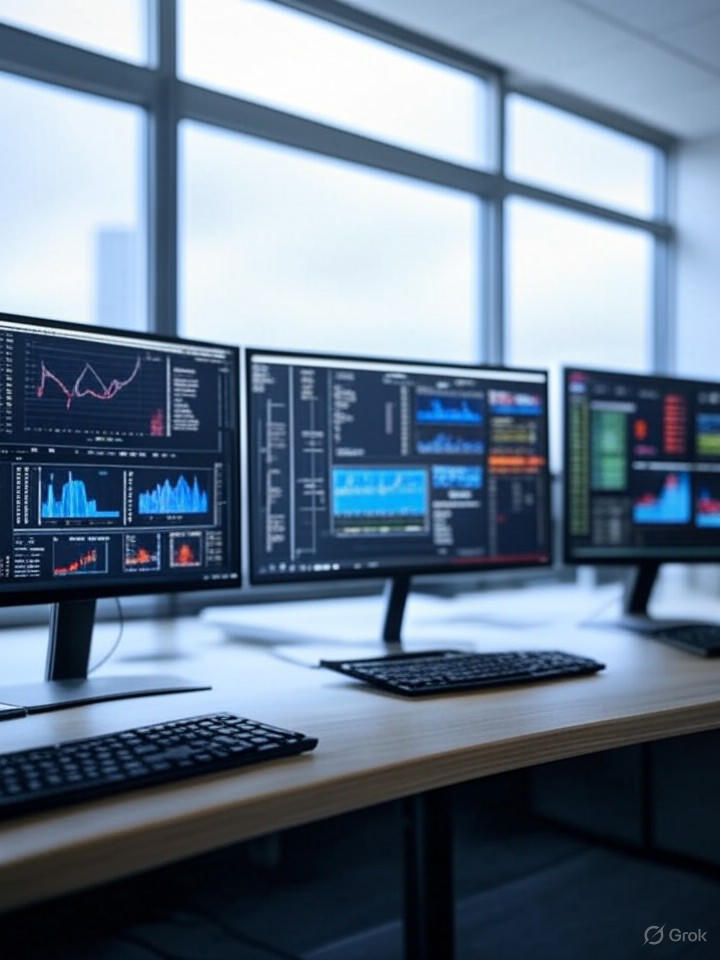
Meanwhile, real-time dashboards, a trend spotlighted in a Closeloop analysis, leverage orientation and texture for dynamic displays, allowing enterprise users to track live metrics without cognitive overload. This evolution underscores a shift toward immersive experiences, where virtual reality incorporates spatial position to simulate three-dimensional data interactions.
Trends Shaping 2025 Insights
Looking ahead, 2025 promises a surge in AI-narrated visualizations, as noted in Luzmo’s report on why traditional analytics fall short. Here, visual variables like hue and saturation are paired with natural language processing to generate explanatory overlays, transforming static charts into interactive stories. Posts on X from data analysts emphasize this, with users like Jayen Thakker advocating hierarchies such as bar charts for comparisons and line charts for trends, aligning with Bertin’s principles.
Furthermore, immersive designs are gaining traction, per Fuselab Creative, where shape and texture enable augmented reality overlays for business intelligence. This integration not only amplifies insights but also addresses inclusivity, with color-blind friendly schemes becoming standard.
Challenges and Best Practices
Yet, misuse of visual variables can lead to misinterpretation. Overloading a graph with too many colors, for instance, dilutes focus, a pitfall warned against in Visme’s compilation of top examples. Industry insiders recommend starting with simplicity: use position for precision, size for emphasis, and reserve color for categorical distinctions.
Best practices, drawn from Data Science Society, stress testing visualizations for perceptual accuracy, ensuring variables align with data types—quantitative for size and position, qualitative for shape and color. This disciplined approach fosters clearer decision-making in sectors from finance to healthcare.
Innovation and Future Directions
Innovation continues apace, with Infogram’s forecast pointing to enhanced engagement through micro-interactions, where subtle changes in value or orientation signal updates. X discussions, including those from Joachim Schork, critique traditional plots like box plots, favoring jittered strips for better distributional insights, reflecting a broader push toward human-centered design.
Ultimately, as data visualization matures, mastering visual variables empowers professionals to unlock deeper narratives. By blending Bertin’s timeless framework with cutting-edge trends, practitioners can craft visualizations that not only inform but inspire action in an increasingly data-driven world.

