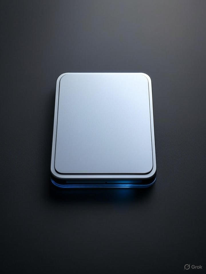
In the latest developer beta of macOS Tahoe 26, Apple has quietly bid farewell to one of its most enduring visual elements: the classic hard drive icon that has symbolized internal storage since the early days of the Macintosh. This icon, depicting a stylized platter-based hard disk drive, is being replaced with a sleeker design resembling a solid-state drive (SSD), marking a subtle yet significant shift in how the company represents modern computing hardware.
The change, first spotted in beta 5 released on August 5, 2025, aligns with Apple’s broader push toward SSD technology, which has dominated its hardware lineup for years. According to a report from 9to5Mac, the new icon features a more minimalist, chip-like appearance, emphasizing the NAND flash storage that powers today’s Macs rather than the mechanical drives of yesteryear.
Evolving Icons in Apple’s Ecosystem
This isn’t the first time Apple has tweaked its iconography to reflect technological advancements. The original Macintosh HD icon, introduced in the 1980s, evoked the physical hard drives of that era, complete with visible platters and a read/write arm. Over decades, it became a nostalgic staple, even as Apple transitioned to SSDs with the MacBook Air in 2008 and later models.
Industry observers note that such updates are part of Apple’s meticulous design philosophy, ensuring visual elements keep pace with hardware realities. As detailed in an analysis by AppleInsider, the retirement of the old icon underscores a commitment to relevance, potentially streamlining user interfaces for a generation unfamiliar with spinning disks.
User Reactions and Customization Options
Feedback from developers and early adopters has been mixed, with some lamenting the loss of a “much-loved” symbol that carried half a decade of history, as highlighted in a piece from T3. Others praise the modernization, arguing it better represents the all-SSD Mac lineup since 2020.
For those attached to the classic look, macOS still offers robust customization tools. Guides from sources like How-To Geek explain how users can manually swap icons via the Finder’s Get Info panel, pasting in custom images to restore the vintage design or create personalized ones.
Broader Implications for macOS Development
This icon swap fits into a pattern of iterative refinements in macOS Tahoe 26, including earlier controversies like the temporary Finder icon color reversal, which Apple corrected in beta 2 after user backlash, as reported by AppleInsider. Such adjustments demonstrate Apple’s responsiveness to its community, particularly developers who rely on consistent interfaces.
From an industry perspective, these changes signal Apple’s focus on forward-looking design, potentially influencing how other operating systems handle legacy visuals. As SSDs become ubiquitous, icons that hark back to obsolete tech may fade across platforms, pushing a more unified aesthetic in software ecosystems.
Looking Ahead to General Release
As macOS Tahoe 26 approaches its public launch later this year, the new hard drive icon is likely to become a standard feature, absent any further reversals. Insiders suggest this could pave the way for additional UI tweaks, such as enhanced support for external drives, where custom icons remain popular for organization.
Ultimately, while the change may seem minor, it encapsulates Apple’s ethos of evolution, blending nostalgia with innovation to keep its operating system attuned to contemporary hardware realities. For longtime Mac users, it’s a reminder that even icons aren’t immune to the march of progress.


 WebProNews is an iEntry Publication