
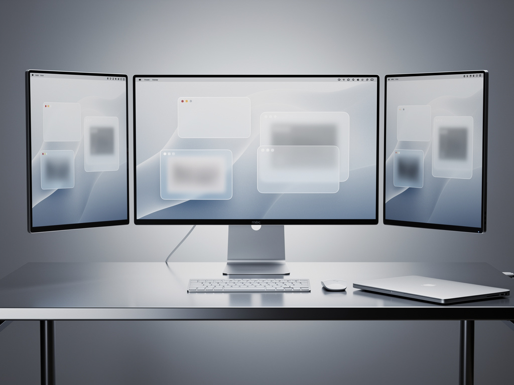
Apple rarely admits fault with its software designs. Yet the arrival of Liquid Glass last year left many Mac users frustrated. Text blurred against translucent panels. Shadows fell in odd places. Sidebars became hard to parse. The new aesthetic, meant to feel modern and fluid, instead created practical headaches on desktop displays.
Now comes a correction. According to Bloomberg’s Mark Gurman, macOS 27 will bring what insiders call a “slight redesign.” The goal? Make Liquid Glass appear exactly as Apple’s design team pictured it from day one. The changes target those shadows and transparency quirks that undermined readability. And they reflect a wider company push toward polish over flash this year.
The problems surfaced quickly after macOS 26, also known as Tahoe, shipped. Users complained about contrast issues in apps with sidebars or dense text. Control Center elements sometimes faded into backgrounds. On laptops and desktops still dominated by LCD panels, the effects that popped on OLED-equipped iPhones looked muddy. Bloomberg reported that the translucency, shadows, and glass-like rendering simply performed better on newer mobile hardware.
But Apple didn’t scrap the concept. Far from it. Gurman quoted sources saying last year’s operating systems “didn’t necessarily suffer from design problems, I’m told, but rather a not-completely-baked implementation from Apple’s software engineering team.” The design itself stayed. The execution needed work.
So here we are.
TechRadar captured the sentiment in its headline: the update aims to deliver Liquid Glass “the way Apple’s design team intended it from the start.” That phrase echoes across recent coverage. It suggests internal confidence in the material’s potential even as external voices questioned its readiness for the Mac. The refinements will adjust how transparency interacts with content behind it. They will recalibrate shadow placement to preserve legibility without sacrificing the glassy depth. TechRadar noted that these tweaks focus on areas where textures reduce text clarity or create interface confusion.
9to5Mac went further. It highlighted sidebar transparency as a particular pain point. If your specific gripe involved poor contrast in Tahoe apps, the next version might resolve it. The site reported that the Tahoe version of the interface felt unfinished. macOS 27 cleans up those rough edges. 9to5Mac detailed how the changes align with Apple’s broader emphasis on quality and refinement across its 2026 software releases.
Critics had wondered whether the departure of longtime design executive Alan Dye would prompt a retreat from the new look. He left for Meta late last year. Speculation followed. Yet Gurman pushed back on that idea months ago. The company still loves Liquid Glass, he wrote in an earlier newsletter. The direction came from a team, not one person. Rounded window corners and the glassy material appear here to stay.
Apple first unveiled Liquid Glass in June 2025. The company called it its broadest software design update ever. Real-time rendering let the material react to movement with specular highlights. It brought a sense of depth and dynamism to iOS 26, iPadOS 26, and macOS 26. On phones and tablets the effect often succeeded. Motion felt natural. The glass-like surfaces added visual interest without overwhelming the content.
On the Mac the translation proved trickier. Desktop workflows rely on dense information layouts. Windows overlap. Toolbars and sidebars compete for attention. When those elements turn translucent in ways that obscure text, productivity suffers. Some users simply turned off as many transparency effects as possible. Others delayed upgrading altogether.
Recent coverage shows the conversation has shifted. AppleInsider reported that Liquid Glass won’t get killed in macOS 27. Expect a tune-up instead. The site pointed to the same Bloomberg newsletter as the source. Improvements will concentrate on readability. That matches what PCMag, The Verge, and Tom’s Guide also described in articles published over the past day. Each outlet stressed that the redesign remains modest. No one expects a full reversal.
Thurrott.com offered additional context on hardware differences. Paul Thurrott noted that Mac lineups still use industrial designs from several years ago built around LCD screens. The Liquid Glass effects shine brightest on modern OLED displays. This mismatch helps explain why the initial Mac implementation drew sharper criticism than its mobile counterparts.
The timing adds weight. Apple plans to unveil macOS 27 at WWDC next month. The event will also cover iOS 27, visionOS updates, and new Safari features. Insiders expect a focus on stability and efficiency this cycle. Code cleanup aims to deliver better performance and longer battery life. A revamped Siri with chatbot capabilities powered by upgraded AI models will grab headlines too. Yet the Liquid Glass adjustments may matter most to longtime Mac users who felt the previous design compromised daily work.
Gurman has covered Apple for years. His track record on software plans gives this report credibility. Still, details remain sparse. Exactly how Apple will adjust shadows and transparency stays under wraps. Will it increase contrast thresholds? Alter blur radii? Modify how the material blends with underlying content? Developers will likely see the answers in the first beta released shortly after the keynote.
One thing looks clear. Apple views Liquid Glass as a foundational element of its visual language moving forward. The company has doubled down rather than retreat. That decision carries risk. If the refinements fall short, complaints could intensify. If they succeed, the material may eventually feel as natural as the frosted glass of older macOS versions once did.
Either way, the next few months will prove telling. Beta testers will judge whether the design team’s original vision finally reaches the Mac in full. Power users will measure real-world readability gains against the aesthetic goals. And the broader industry will watch to see if Apple’s bet on dynamic, reactive interfaces pays off or requires yet another course correction down the line.
For now, the message from Cupertino seems to be patience. The glass wasn’t broken. It just needed better crafting.

