
Apple faced a storm of feedback after it rolled out Liquid Glass last year. The translucent material, which reflects and refracts surroundings while shifting to highlight content, drew praise for its expressiveness. Yet plenty of users found the default look too busy or hard to read in daily use. Now iOS 27 responds with a system-wide slider. The new control sits in Settings under Appearance and lets anyone tune the effect from ultra clear to fully tinted. No more binary choices. Just a smooth adjustment that updates the entire interface in real time.
The change builds on earlier experiments. In iOS 26.2 Apple added a limited slider for the Lock Screen clock opacity. MacRumors reported that Bloomberg’s Mark Gurman expected the feature to expand. It has. The iOS 27 version applies everywhere. Tab bars, notifications, sidebars, app icons. All of it responds.
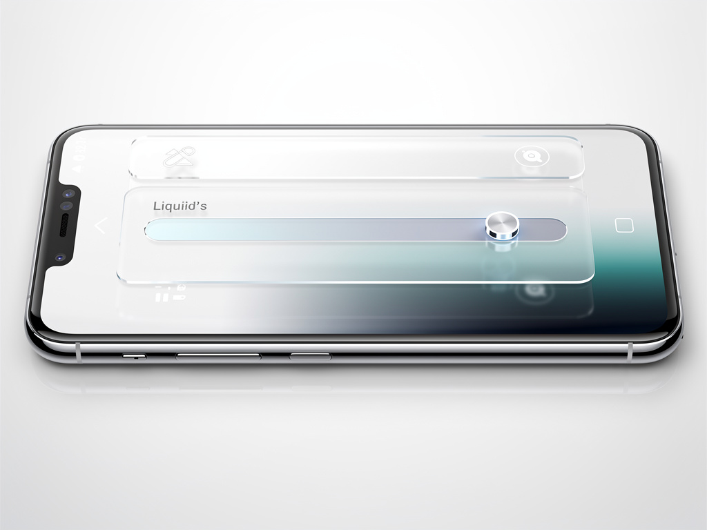
Developers and beta users see the difference immediately. Move the slider left and backgrounds grow nearly invisible. Text and controls float with minimal obstruction. Push it right and the glass turns frosted. Contrast rises. Underlying apps blur into soft color fields. The preview inside the settings screen shows a sample text input box reacting live. Drag the control. Watch the box shift against its backdrop. Simple. Effective.
From Controversy to Customization
Critics of the original Liquid Glass pointed to legibility problems. Black text over dark blurred backgrounds created strain. Apple listened. The new implementation adds a darkened edge around glass elements and brighter specular highlights. These touches create separation. Complex content behind the material diffuses better. Readability improves across the board. In the Messages app, even at maximum transparency, text stays clear thanks to smart blurring. Ben Lovejoy at 9to5Mac tested the extreme setting. “I decided to experiment with it, starting with the effect maxed out… yet the way Apple blurs the underlying content means that the top layer remains perfectly readable.” He called the result a complete solution to the first version’s flaws. No legibility issues appeared in several days of use.
But the slider does more than fix complaints. It hands choice back to the user. Some prefer the glassy, almost nonexistent effect. Others want the tinted, material-like depth. The control spans the full spectrum. Apple shows three example points in its documentation: most transparent, default, and most tinted. Reality offers every stop in between. Lock Screen notifications change dramatically. At the clear end they overlay photos with almost no frame. At the tinted end they sit in distinct frosted rectangles. App Store pages gain new breathing room. Podcasts controls look crisp or softly contained depending on the setting.
Recent hands-on reports confirm the immediacy. Writers at Mashable pushed the slider straight to ultra clear upon installing the developer beta. The interface transformed. Icons appear sharper and more defined than before. New refraction options add selective character without overwhelming the screen. The design now adapts automatically to accessibility preferences such as Reduce Transparency or Increase Contrast. Apps built for the prior version pick up these refinements without code changes. Developers gain updated tools too. Icon Composer supports multiple layers of the material with annotations for refraction effects and an interactive preview that simulates older operating systems.
Sidebars and scrolling behavior received attention as well. When content passes under floating bars the system now displays a uniform toolbar at the top. Text stays legible. Contrast holds. The adjustment feels thoughtful rather than reactive. It addresses specific pain points that emerged after the initial launch.
Apple’s own newsroom announcement highlighted the feature alongside broader iOS 27 updates. “A new slider in Settings gives users the option to personalize Liquid Glass, adjusting it anywhere from ultra-clear to fully tinted to match their preference,” the company stated in its WWDC coverage. The material still refracts and reflects. It still shifts focus. But now the intensity belongs to the owner of the device.
Industry observers note the data angle. One suggestion circulating on forums and mentioned by Lovejoy at 9to5Mac points to anonymized collection of slider positions. If large numbers of users crank the control toward maximum clarity, Apple might extend the range even further in future releases. The company has not confirmed such tracking. Yet the possibility shows how user behavior can shape future tweaks.
Recent coverage adds fresh perspective. On June 15, beta testers shared video on X showing how Liquid Glass now adapts better to background colors instead of applying a uniform darker tint. Animations look more polished. Tab bars mimic real glass with convincing depth. These small refinements compound. The interface feels less like a compromise and more like a flexible surface.
Of course not everyone will care. Plenty of iPhone owners stick with defaults. For interface enthusiasts and accessibility users the slider represents a meaningful shift. It acknowledges that one size never fit all. The original Liquid Glass aimed for delight and vitality. The iOS 27 version adds precision. Users can now match the material to their eyesight, their environment, their taste.
Installation requires the developer beta for now. Public release comes later this year. When it arrives the setting will sit quietly in the Appearance menu. Most people may never touch it. Those who do will find an iPhone that looks and feels more personal. The glass still flows. But the flow obeys the hand that holds the device.
And that may be the quiet victory here. Apple took criticism, studied the data, and returned with a knob. Not a full redesign. Not a return to the past. A simple slider that makes the controversial material usable for far more people. In an industry quick to declare winners and losers, this feels like quiet progress. The kind that matters most to those who stare at their screens for hours every day.

