
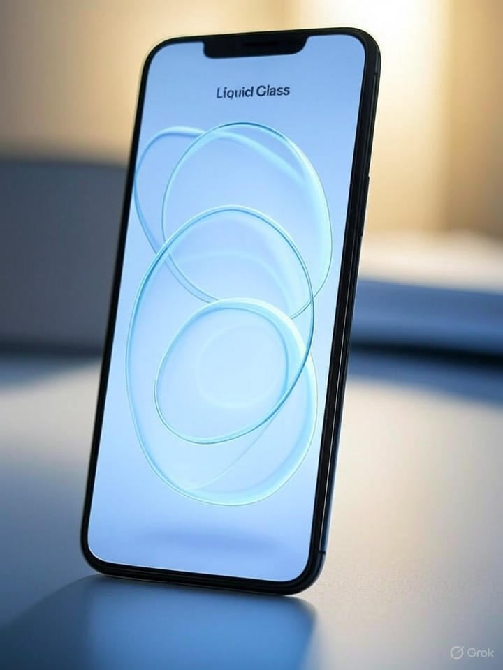
In the ever-evolving world of mobile operating systems, Apple’s latest iOS 26 has sparked intense debate among user experience experts, with its ambitious “Liquid Glass” design language drawing sharp criticism for prioritizing aesthetics over functionality. Released just weeks ago, the update introduces a translucent, fluid interface that aims to blend elements seamlessly, but according to a recent analysis, it may be doing more harm than good to everyday usability.
The critique comes from the Nielsen Norman Group, a venerable UX research firm founded by industry pioneers Jakob Nielsen and Don Norman. In an article published on their site titled “Liquid Glass Is Cracked, and Usability Suffers in iOS 26,” author Raluca Budiu dissects how the new visual paradigm obscures content and disrupts established interaction patterns, leading to user frustration.
Design Innovation or Usability Pitfall?
Budiu’s piece, as highlighted in a blog post on anderegg.ca, points out specific flaws such as overly subtle button affordances and inconsistent navigation cues that force users to hunt for controls. This isn’t the first time the Nielsen Norman Group has taken Apple to task; their past evaluations, including a 2013 review of iOS 7 published on their site, similarly warned against flat designs that sacrifice clarity for minimalism.
For industry insiders, these issues raise broader questions about Apple’s design philosophy under pressure from competitors like Android’s Material You. The Liquid Glass approach, detailed in Apple’s own support pages on support.apple.com, promises a “more expressive and seamless experience,” but critics argue it alienates power users who rely on intuitive interfaces for productivity.
Impact on User Behavior and Adoption
Eyetracking studies referenced in Nielsen Norman Group’s ongoing research, available on nngroup.com, reveal how such designs disrupt the natural “F-pattern” of reading, where users scan screens in an F-shape. In iOS 26, translucent overlays can blur this pattern, increasing cognitive load and error rates, as Budiu notes in her scathing assessment.
This has real-world implications for app developers and enterprises. Discussions on forums like Hacker News echo these sentiments, with developers lamenting the need to redesign apps to accommodate the fluid aesthetics, potentially delaying updates and raising costs.
Historical Context and Future Implications
Looking back, the Nielsen Norman Group’s Wikipedia entry underscores their track record since 1998 in analyzing interfaces, from Windows 8 to AI-driven UIs. Their iOS 26 takedown fits this pattern, suggesting Apple might need to iterate quickly, much like they did post-iOS 7 after similar feedback from the group, as archived in older articles on TidBITS.
For tech executives, this serves as a cautionary tale: innovation must balance with usability heuristics. As one commenter on the anderegg.ca post put it, the frustrations summarize a growing disconnect between Apple’s vision and user needs.
Industry Ripple Effects
Beyond Apple, this critique could influence broader UX trends. The Nielsen Norman Group’s podcast episodes, hosted on Listen Notes, often explore how visual trends affect accessibility, a point Budiu emphasizes in her iOS 26 piece.
Ultimately, while iOS 26’s Liquid Glass may dazzle in demos, its cracked foundation, as per the Nielsen Norman Group’s expert lens, underscores the timeless UX truth: form should follow function, not eclipse it. Apple has yet to respond publicly, but history suggests refinements could come in forthcoming point releases, potentially salvaging the update’s ambitious goals.

