
Apple has introduced two new design languages for macOS called Golden Gate and Liquid Glass, signaling a significant shift in how the operating system will look and feel in future versions. According to a detailed report from MacRumors, these visual approaches represent years of internal experimentation at the company and could appear in macOS 27 or later releases. The news has generated considerable discussion among developers, designers, and longtime Macintosh users who have watched the platform evolve from its classic Aqua interface through multiple refinements.
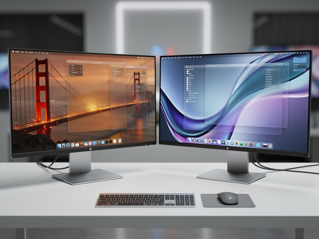
The Golden Gate design takes direct inspiration from the architectural elements of San Francisco’s iconic bridge. Sources familiar with the project describe translucent structural elements that mimic suspension cables and tower forms, creating a sense of depth and connection across different parts of the interface. Windows may feature subtle cable-like dividers that separate content areas while maintaining visual continuity. The overall effect aims to give users a feeling of stability and strength, qualities historically associated with the bridge itself. Color palettes under consideration include warm metallic golds mixed with deep charcoal tones and occasional bright orange accents that echo the bridge’s iconic lighting at night.
Designers working on Golden Gate have focused heavily on typography that feels anchored and substantial. System fonts receive slight modifications to their weight and spacing to complement the architectural theme. Menu bars and sidebars adopt a more pronounced three-dimensional quality through careful use of shadows and highlights that suggest solid materials rather than flat digital surfaces. The report from MacRumors indicates that Apple’s human interface team spent considerable time studying how natural light interacts with steel and concrete to recreate similar effects on screen.
By contrast, Liquid Glass takes a completely different direction by emphasizing fluidity and transparency. This approach builds upon the glass-like materials introduced in previous versions of macOS but pushes the concept much further. Elements appear to float above the desktop with varying degrees of opacity that change based on user interaction and system state. When users move windows across the screen, these elements exhibit realistic refraction effects similar to actual glass objects. The MacRumors article explains that engineers developed new rendering techniques to achieve these visual properties without compromising performance on Mac hardware ranging from older Intel models to the latest Apple silicon chips.
Developers who have seen early prototypes describe the Liquid Glass windows as having flexible borders that respond to cursor proximity. As the pointer approaches an edge, the border may slightly bend or ripple before returning to its original shape when the cursor moves away. Scroll bars transform into flowing streams of light that indicate content position while adding subtle movement to otherwise static interfaces. These animations remain restrained enough to avoid distraction during productive work but provide enough visual feedback to make interactions feel more tactile.
Both design languages maintain strong connections to Apple’s existing visual identity while introducing fresh characteristics. The company has reportedly created extensive guidelines that ensure applications built by third-party developers can adopt either style without creating visual conflicts. This compatibility matters particularly for professional software used in creative fields where consistency across tools helps maintain user focus. The MacRumors piece notes that Apple conducted multiple rounds of user testing to determine which aspects of each design resonated most strongly with different professional groups including photographers, video editors, software engineers, and financial analysts.
One particularly interesting aspect of these new directions involves how they handle dark mode. Rather than simply inverting colors, both Golden Gate and Liquid Glass incorporate specialized treatments for nighttime use. Golden Gate dark mode emphasizes the bridge’s evening illumination with carefully calibrated warm lighting effects against cooler background tones. Liquid Glass in dark environments creates deeper translucency that allows more of the desktop wallpaper to show through while maintaining readability of text and interface controls. These adaptations demonstrate Apple’s attention to the full range of lighting conditions under which people use their computers.
The technical implementation of these designs required substantial updates to Core Animation and Metal frameworks. Apple’s engineers developed new shaders specifically for rendering the liquid-like distortions in the Liquid Glass approach. These computational methods calculate light behavior in real time as users resize windows or drag elements across the screen. The performance demands of such calculations explain why the company has focused recent hardware improvements on graphics capabilities even in base model Macs. Users with M-series chips will likely see the smoothest experience though older Intel-based systems should still support the basic features.
Accessibility considerations received significant attention during development. Both designs include options to reduce motion for users sensitive to animations. Liquid Glass effects can be scaled back to simple transparency without losing the material quality entirely. Golden Gate offers settings to simplify the structural elements for those who prefer cleaner interfaces. The MacRumors report highlights that Apple created multiple variants of each design to accommodate different user preferences and work requirements. This flexibility suggests the company wants to avoid forcing a single aesthetic on its diverse customer base.
Industry observers point out that these visual experiments reflect Apple’s response to design trends seen in competing platforms. Windows has embraced more three-dimensional elements in recent releases while various Linux desktop environments have explored advanced transparency effects. Rather than following these developments, Apple appears to be charting its own course by combining architectural solidity with material innovation. The dual approach gives the company options as it evaluates which direction resonates more strongly with users during the beta testing phases.
Early reactions from the developer community show a mixture of excitement and practical concerns. Many appreciate the fresh appearance these designs would bring to the platform after years of relatively conservative updates. The possibility of choosing between two distinct visual languages appeals to users who customize their computing environments extensively. However some worry about the learning curve associated with significantly different interface behaviors. Applications that have relied on certain visual cues for decades might need substantial redesigns to take full advantage of the new capabilities.
The timing of this information coincides with growing speculation about Apple’s broader software strategy. With visionOS establishing new interface conventions in spatial computing, the company seems intent on refreshing its traditional platforms to maintain visual coherence across product lines. Elements from both Golden Gate and Liquid Glass could potentially appear in future iOS updates as well though the MacRumors article focuses primarily on Macintosh applications. The shared design language would help users transition smoothly between devices while still allowing each platform to optimize for its specific input methods and use cases.
Implementation details suggest these changes will not arrive all at once. Apple typically introduces new visual features gradually across several software releases to allow developers and users to adapt. Initial versions might offer the new designs as optional appearances while keeping the current macOS look as the default. This measured approach has served the company well during previous interface transitions and helps minimize disruption for people who depend on their Macs for critical work.
The materials research that enabled Liquid Glass deserves particular recognition. Apple’s design team reportedly studied everything from high-end crystal glassware to industrial architectural installations when developing the optical properties. The resulting interface elements exhibit convincing caustics and reflections that shift naturally as lighting conditions change within the operating system. These effects extend beyond simple visual appeal to provide additional information about window hierarchy and focus states through subtle differences in how light passes through different layers.
Golden Gate’s structural approach offers practical benefits beyond its distinctive appearance. The cable-like elements can serve as visual guides for alignment when positioning multiple windows. The tower-inspired title bars provide more space for controls and status indicators without crowding the content area. This thoughtful integration of form and function demonstrates how Apple’s designers consider both aesthetic and practical aspects when creating new interface systems.
As development continues, Apple will likely refine both directions based on feedback from internal testing and eventual public betas. The company has established a pattern of adjusting features in response to real-world usage patterns rather than strictly following initial concepts. Some aspects of Golden Gate or Liquid Glass may merge together in the final implementation while others might be reserved for specific product lines or professional applications.
Users can expect to see hints of these designs in upcoming developer previews though full implementation will probably wait until the operating system reaches a point where fundamental interface changes make sense. The transition to these new visual languages represents a substantial undertaking that affects every aspect of the user experience from system preferences to third-party applications. Apple’s careful pacing suggests the company understands the significance of such modifications and wants to execute them properly.
The introduction of Golden Gate and Liquid Glass marks another chapter in macOS’s long visual history. From the original platinum appearance through Aqua’s liquid-like buttons, the brushed metal era, and the various translucency experiments of recent years, the operating system has consistently evolved its appearance while maintaining core usability principles. These latest concepts build upon that foundation while exploring new possibilities that advanced graphics hardware now makes practical.
Professional designers following these developments will find plenty of inspiration in the detailed material properties and thoughtful structural elements. The combination of architectural inspiration with advanced material simulation creates opportunities for interface design that feels both familiar and entirely new. As more information emerges from Apple’s development process, the community will gain clearer understanding of how these concepts might translate into daily computing experiences across different types of workflows and user preferences.
The careful balance between innovation and continuity remains a defining characteristic of Apple’s approach to software design. By offering two distinct directions in Golden Gate and Liquid Glass, the company demonstrates confidence in its design vision while acknowledging that different users may prefer different aesthetic approaches. This flexibility could prove valuable as macOS continues to serve an increasingly diverse group of professionals and enthusiasts who each bring their own expectations to the platform. The coming years will reveal which elements resonate most strongly and how these new visual languages ultimately shape the Macintosh experience for years to come.

