
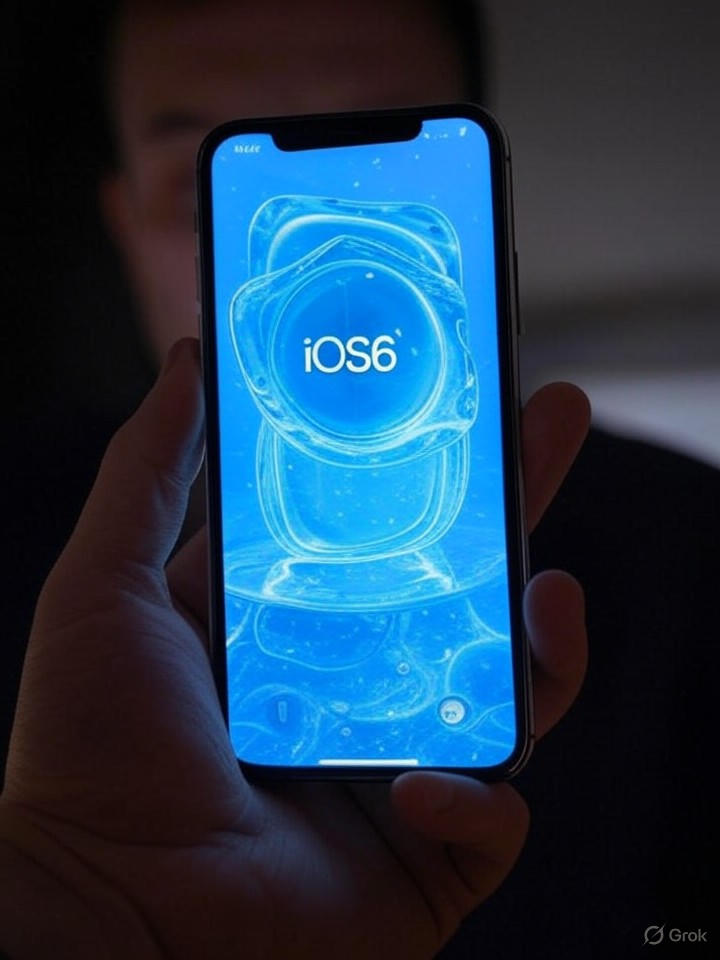
In the ever-evolving world of mobile interface design, Apple’s latest aesthetic overhaul, dubbed Liquid Glass, has sparked both admiration and unexpected controversy. Introduced with iOS 26, this design language draws inspiration from translucent, refractive elements reminiscent of the Vision Pro headset, aiming to blend digital interfaces seamlessly with the physical world. Yet, as users delve into the update, a peculiar issue has emerged: an optical illusion causing vertigo-like symptoms for some, particularly in dark mode where app icons appear disconcertingly tilted.
Reports indicate that the problem stems from how Liquid Glass renders icon edges, creating a subtle slant that tricks the eye into perceiving imbalance. This isn’t a universal complaint, but for those affected, it’s more than a minor annoyance—it’s disorienting enough to evoke dizziness or nausea, reminiscent of motion sickness from mismatched visual cues. Early adopters on social platforms and forums have shared screenshots and anecdotes, highlighting how the glossy, fluid aesthetics, while innovative, can disrupt spatial perception on smaller screens.
The Roots of Liquid Glass and Its Cross-Platform Echoes
Apple’s push for Liquid Glass follows closely on the heels of Android’s Material 3 Expressive updates, as noted in a June analysis by Android Authority, which positioned it as a competitive response in the design arms race. The intent was to create immersive, glass-like interfaces that refract light and add depth, but the execution in dark mode amplifies edge distortions, leading to the vertigo effect. Industry observers point out that this isn’t Apple’s first brush with accessibility hiccups; past updates have faced criticism for prioritizing flair over usability.
Meanwhile, Android enthusiasts haven’t been idle. Developers have replicated similar effects through open-source libraries, such as the Jetpack Compose Liquid Glass project on GitHub, allowing users to experiment without official rollouts. These adaptations often fare better in avoiding perceptual pitfalls, with some users claiming superior implementations, as seen in a Threads post from June where one creator boasted that Android versions “look better than iOS 26” by simply installing a few apps.
User Backlash and Accessibility Concerns
The vertigo reports gained traction quickly after iOS 26’s release, with Android Authority detailing how the illusion affects a subset of users, making icons seem slanted and triggering discomfort. Apple Insider echoed this just hours ago, noting that while not everyone perceives the tilt, those who do describe it as a disorienting optical trick that can induce dizziness. This has reignited debates on inclusive design, especially for individuals sensitive to visual motion, such as those with vestibular disorders.
Critics argue that Liquid Glass, praised in outlets like WebProNews for its innovative blending of worlds in iOS 26 and macOS Tahoe, overlooks readability in favor of spectacle. French publication Les Numériques suggested a quick fix: disabling certain visual effects in settings to restore clarity, a workaround that’s gaining popularity among frustrated users.
Industry Implications and Future Adjustments
For tech giants like Apple, such feedback loops are crucial in refining user experiences. The controversy underscores a broader tension in UI evolution—balancing cutting-edge aesthetics with practical ergonomics. Android alternatives, like the Liquid Glass icon pack available on Uptodown, offer customizable options that mitigate these issues, providing over 2,500 icons with minimal distortion, as highlighted in a How-To Geek review from July.
As developers on platforms like Reddit’s reactnative subreddit explore cross-platform Liquid Glass alternatives, the focus shifts to performance-friendly implementations that avoid compromising accessibility. Apple may yet tweak the design in upcoming patches, but for now, the vertigo saga serves as a cautionary tale: even the most polished interfaces can falter when they push visual boundaries too far, reminding insiders that user comfort must anchor innovation.

