
In the ever-evolving world of mobile operating systems, Google’s latest Android 16 update is poised to redefine user personalization, particularly through its enhanced app icon customization features. Drawing from insights in a recent report by TalkAndroid, the beta rollout of Android 16 introduces tools that allow users to tweak app icons in ways that go beyond mere color adjustments, offering shapes, styles, and thematic integrations that sync seamlessly with device wallpapers.
This shift comes as Google continues to push Material You design principles, which emphasize dynamic theming based on user preferences. Industry observers note that while previous Android versions allowed some icon theming, Android 16’s QPR2 beta expands this to include mandatory monochrome filters for all apps, ensuring a cohesive aesthetic across the home screen. Developers, according to the Android Central coverage, can no longer opt out, marking a bold move toward universal customization.
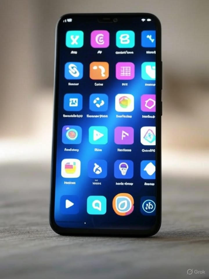
Expanding Icon Shapes and User Control
One of the standout additions in this update is the ability to select from multiple icon shapes, such as circles, squares, and even more intricate designs like arches or cookies. As detailed in NotebookCheck.net, the QPR2 Beta 2 for Pixel devices offers five distinct choices, empowering users to tailor their interfaces with unprecedented flexibility. This isn’t just cosmetic; it addresses long-standing user feedback about rigid icon designs that clash with personalized themes.
Furthermore, the integration extends to forced dark mode and auto-theming, where apps without native support are automatically adjusted. Sources from 9to5Google highlight how this ensures that even legacy applications blend into the system’s color palette, derived from the user’s wallpaper. For industry insiders, this represents Google’s strategy to standardize UI elements, potentially influencing app development practices across the ecosystem.
The Implications for Developers and Privacy
Beyond aesthetics, Android 16 introduces practical enhancements like customizable Quick Settings panels and live notifications for real-time updates. A piece in Android Police explores how users can resize tiles for efficiency, transforming the interface into a more intuitive control center. This level of customization could boost productivity, especially for power users who rely on quick access to features.
On the developer side, the mandatory theming rules, set to take effect with Play Store changes on October 15, 2025, as reported by PhoneArena, require apps to provide adaptive icons. This could streamline updates but also raises questions about creative control, with some developers expressing concerns over forced uniformity. Privacy features, such as protections against SMS one-time password hijacking, add another layer, ensuring that customization doesn’t compromise security.
Broader Ecosystem Impact and Future Outlook
As Android 16 rolls out to devices like the Pixel series, the emphasis on icon customization signals a maturing approach to user experience design. Insights from Pocket-lint suggest that while bold, these changes might not fully convince all users yet, given the experimental nature of betas. Nonetheless, for insiders, this update underscores Google’s commitment to innovation in personalization.
Looking ahead, the integration of AI-powered elements, such as weather visuals and cinematic modes in wallpapers, as noted in NextPit, hints at even more immersive customizations. Ultimately, Android 16’s app icon overhaul could set new standards, encouraging competitors to enhance their own theming capabilities and fostering a more user-centric mobile environment.

